Fokus BEZIEHUNGEN
Visual Identity
2025


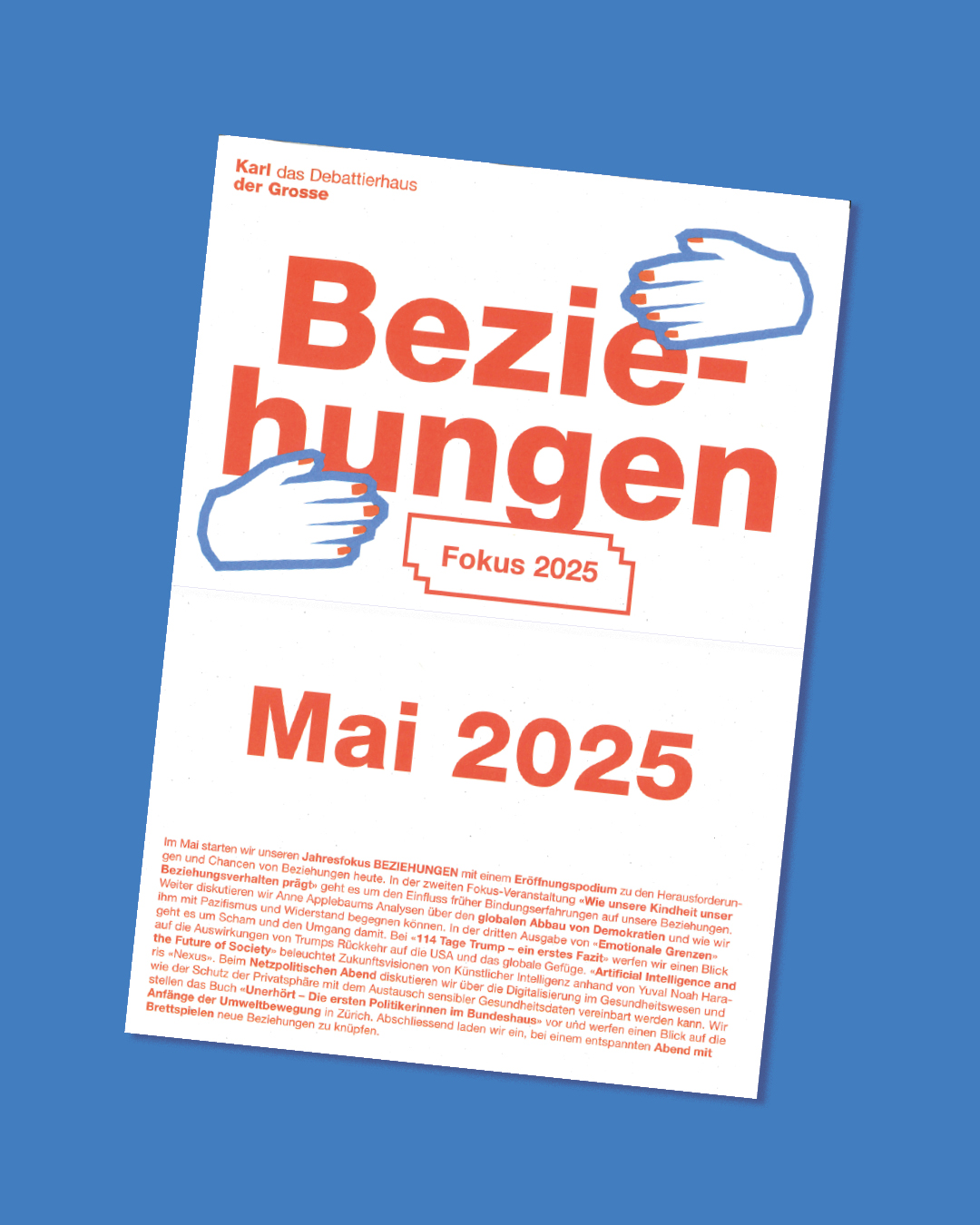

For the
Debattierhaus Karl der Grosse, I was responsible for the design and implementation of the entire communication concept for the annual focus topic
“BEZIEHUNGEN".
This included developing visual materials, coordinating across different channels and ensuring a coherent and engaging presentation that would resonate with different target groups.
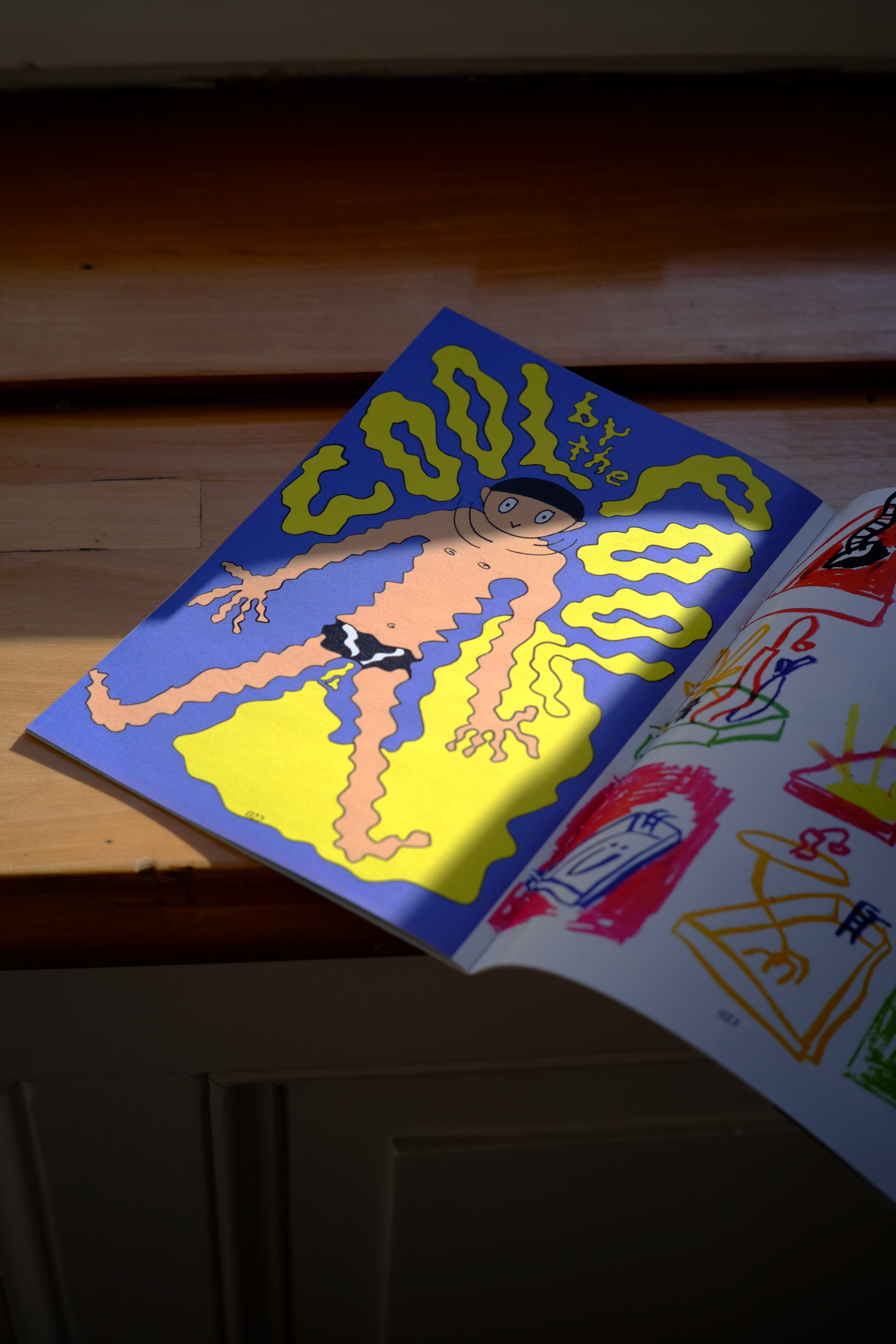
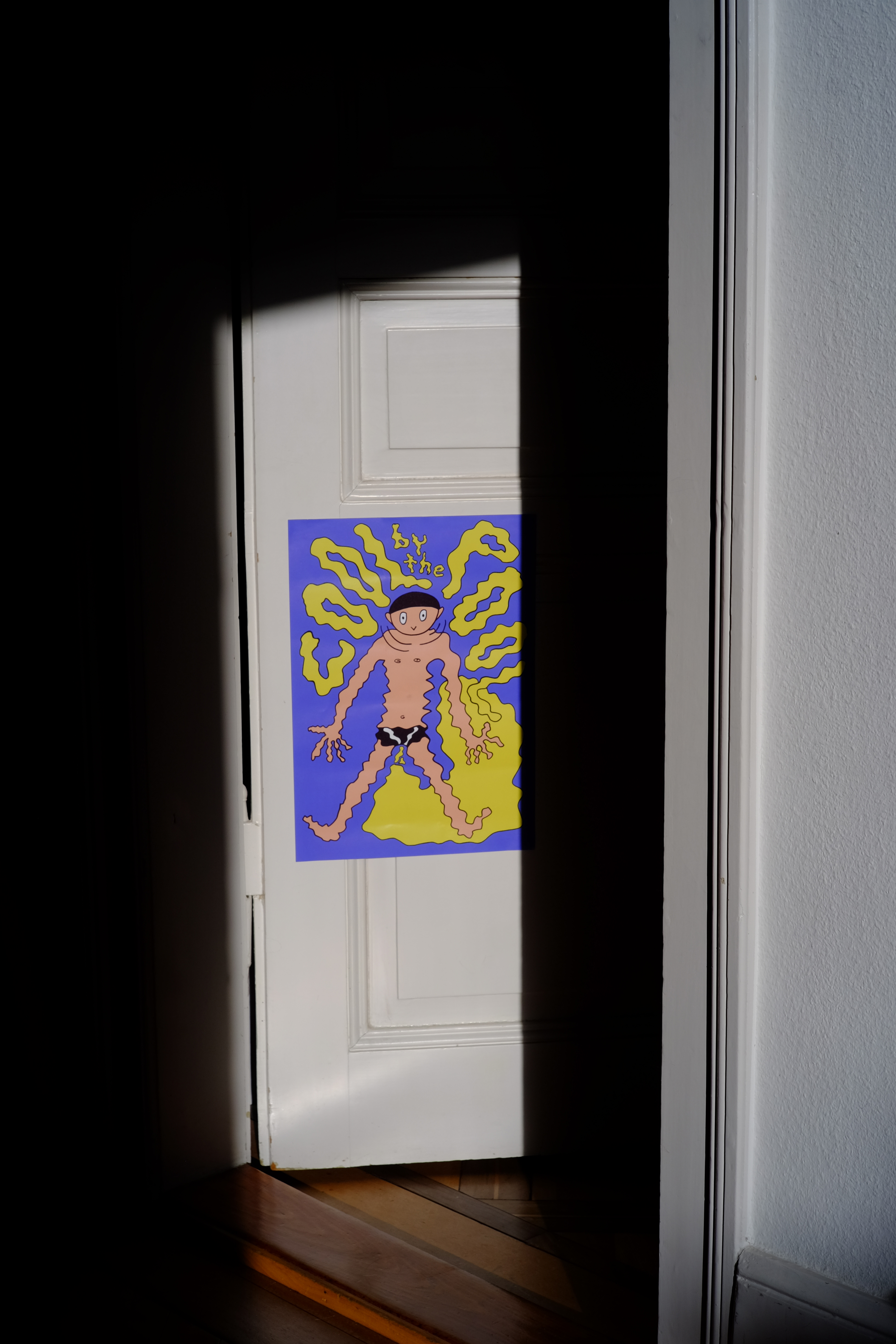
Quere Wege
Gamedesign
2023

Playing, sharing and raising awareness
"Quere Wege" is a tribute to the queer community. It is a reminder of the community's struggles, achievements, and ongoing efforts.
Designed to be played in schools, retirement homes or with friends and family, the game celebrates the richness and diversity of queer lives while building bridges across generations.
It fosters connection, promotes empathy and encourages reflection on queer life paths, creating a space in which we can grow together. It is a reminder that despite our differences, we need to work together and that there is always something to learn from one another.
In cooperation with queerAltern.
Minigolf Hard
Visual Identity
2023
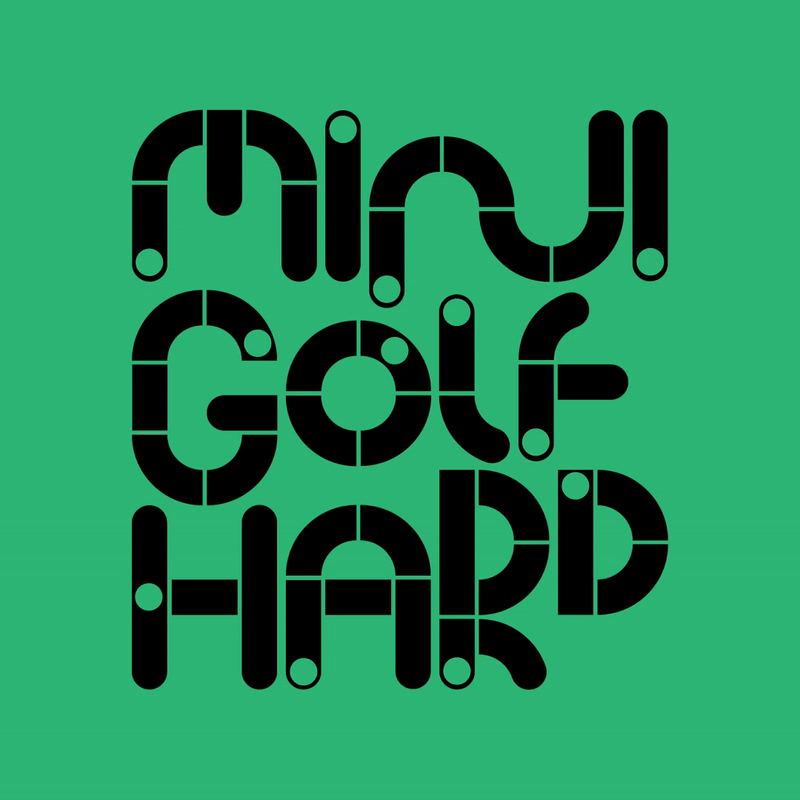

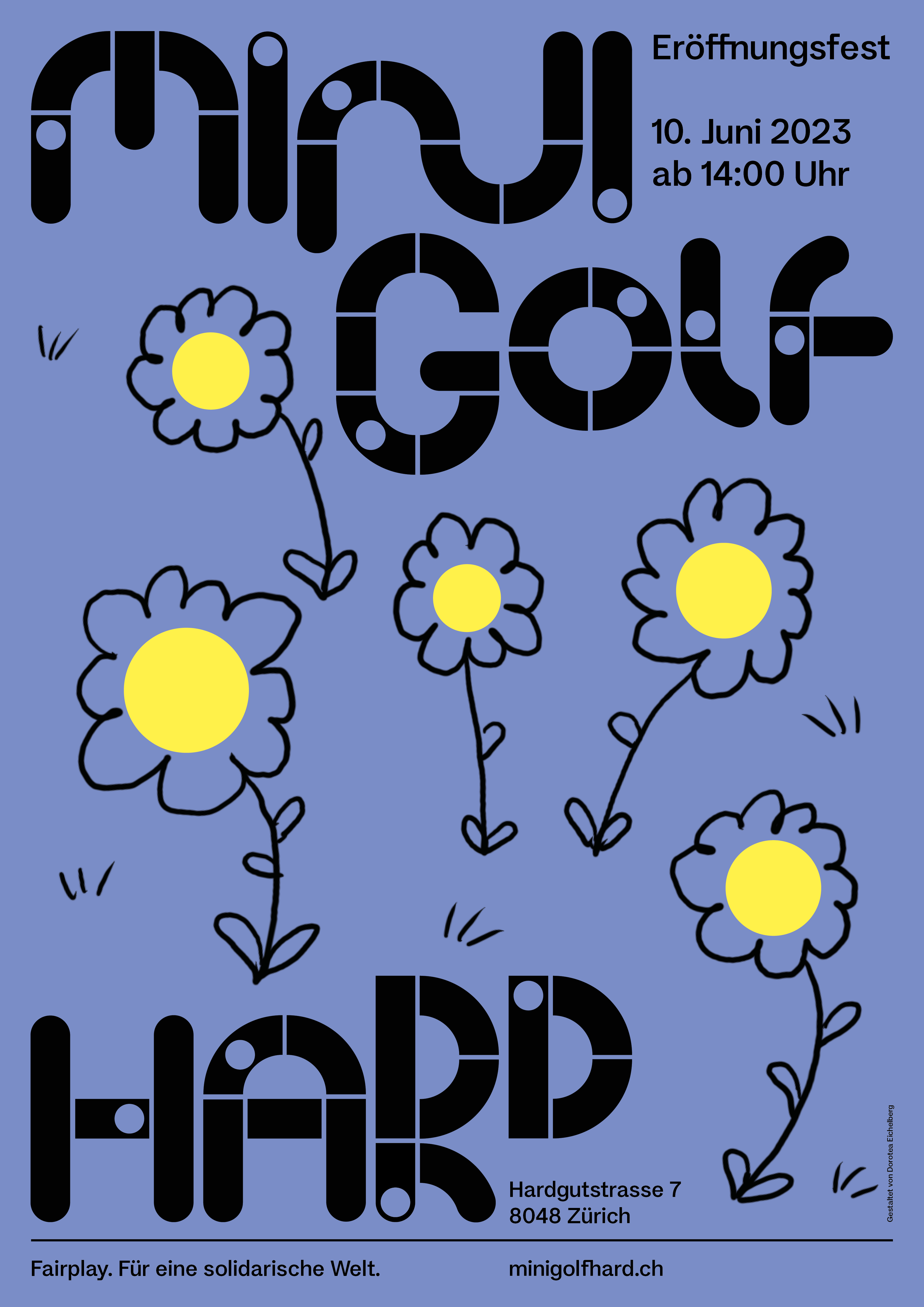


Type design and branding for an unconventional minigolf course run by the Minigolf Hard Verein. Situated away from Zurich's bustling city centre, the Hardgut wasteland offers a unique open space where everyone is welcome to unwind in a sporty and creative way.
It’s a place to be active or simply enjoy the moment. The minigolf tracks, built collaboratively by various collectives, clubs and individuals, reflect the spirit of the area and make each course as unique as the community behind it.
It’s a place to be active or simply enjoy the moment. The minigolf tracks, built collaboratively by various collectives, clubs and individuals, reflect the spirit of the area and make each course as unique as the community behind it.
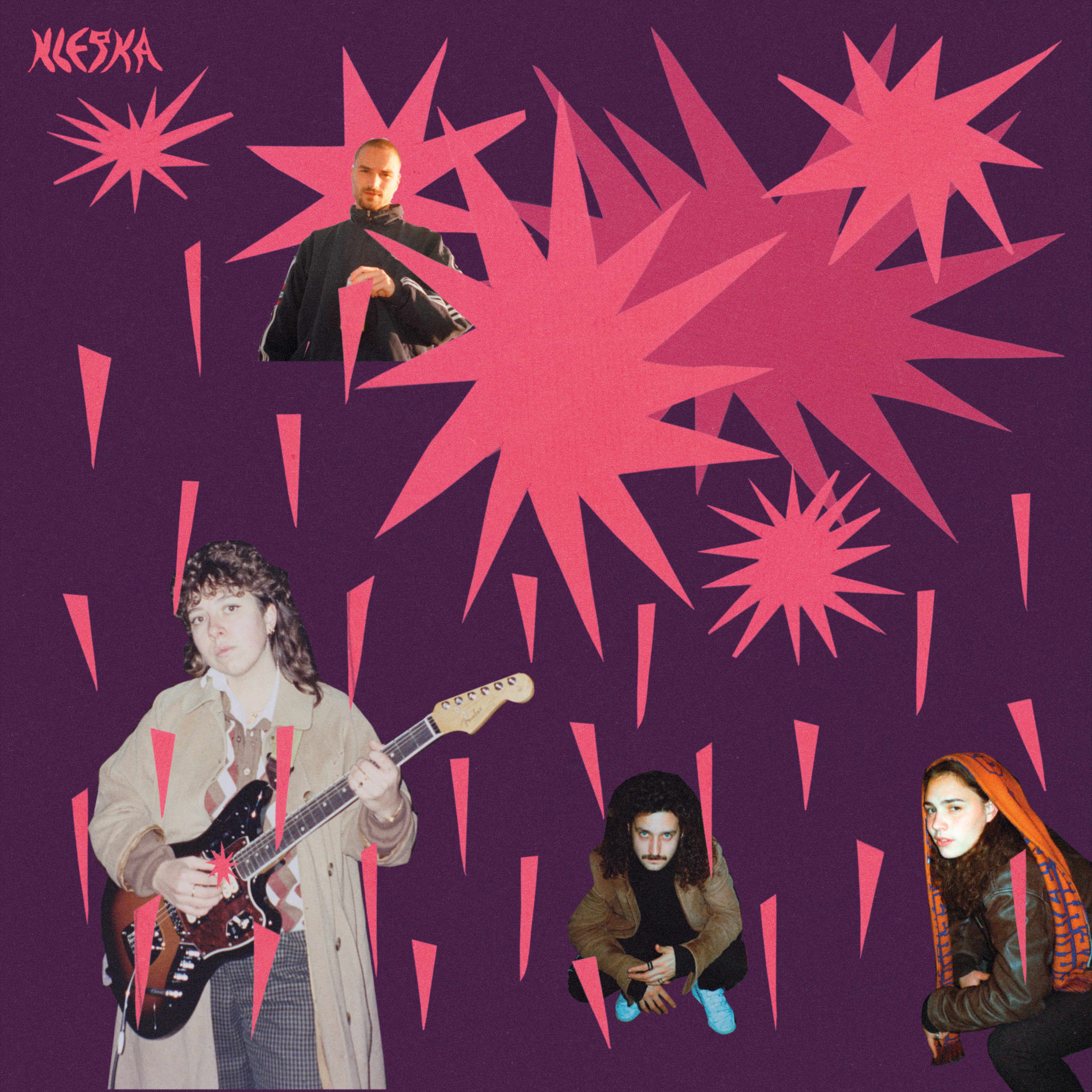
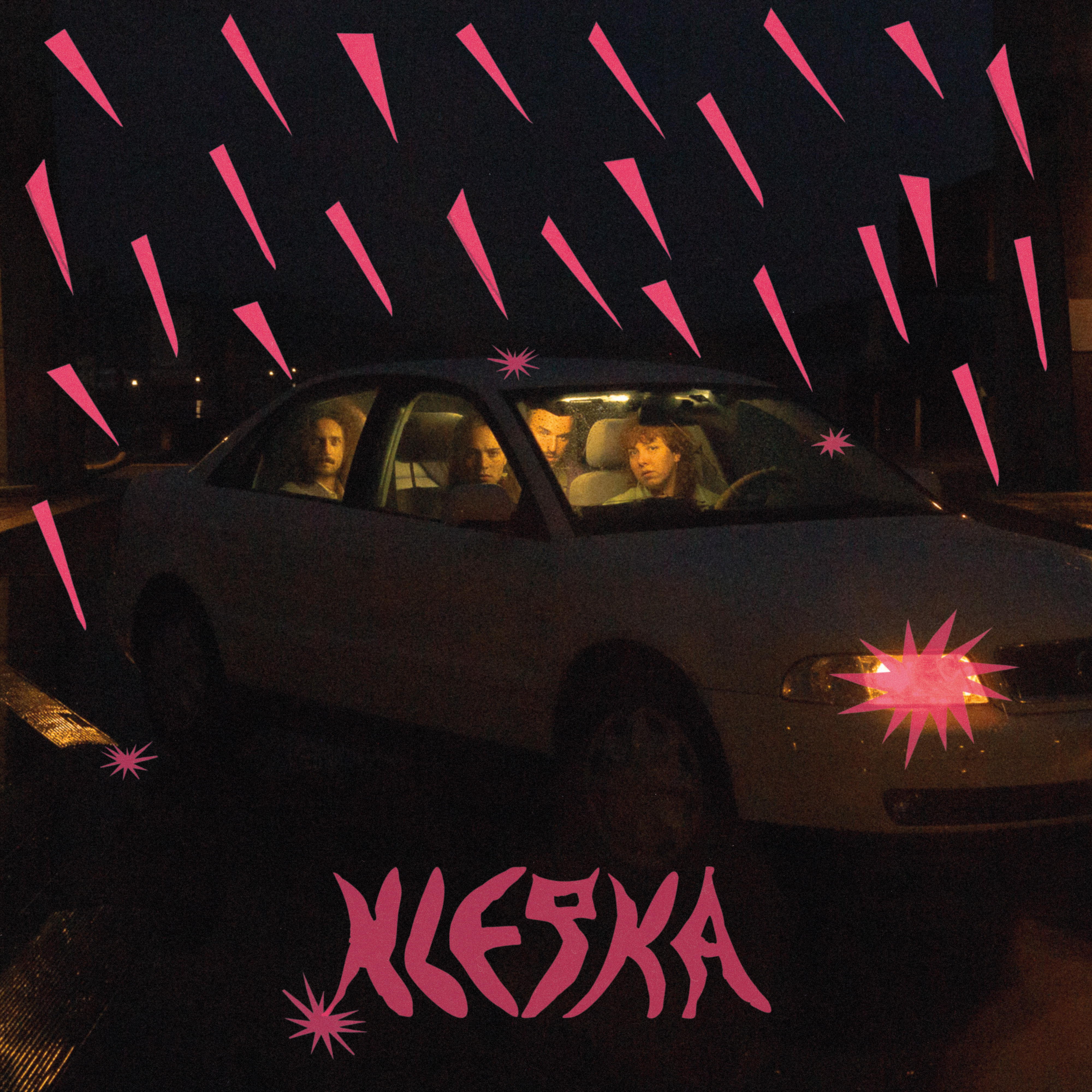
Klepka
Artwork
2022

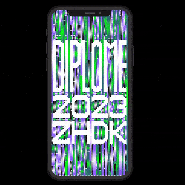
Diplomaustellung ZHdK
Visual Identity
2022
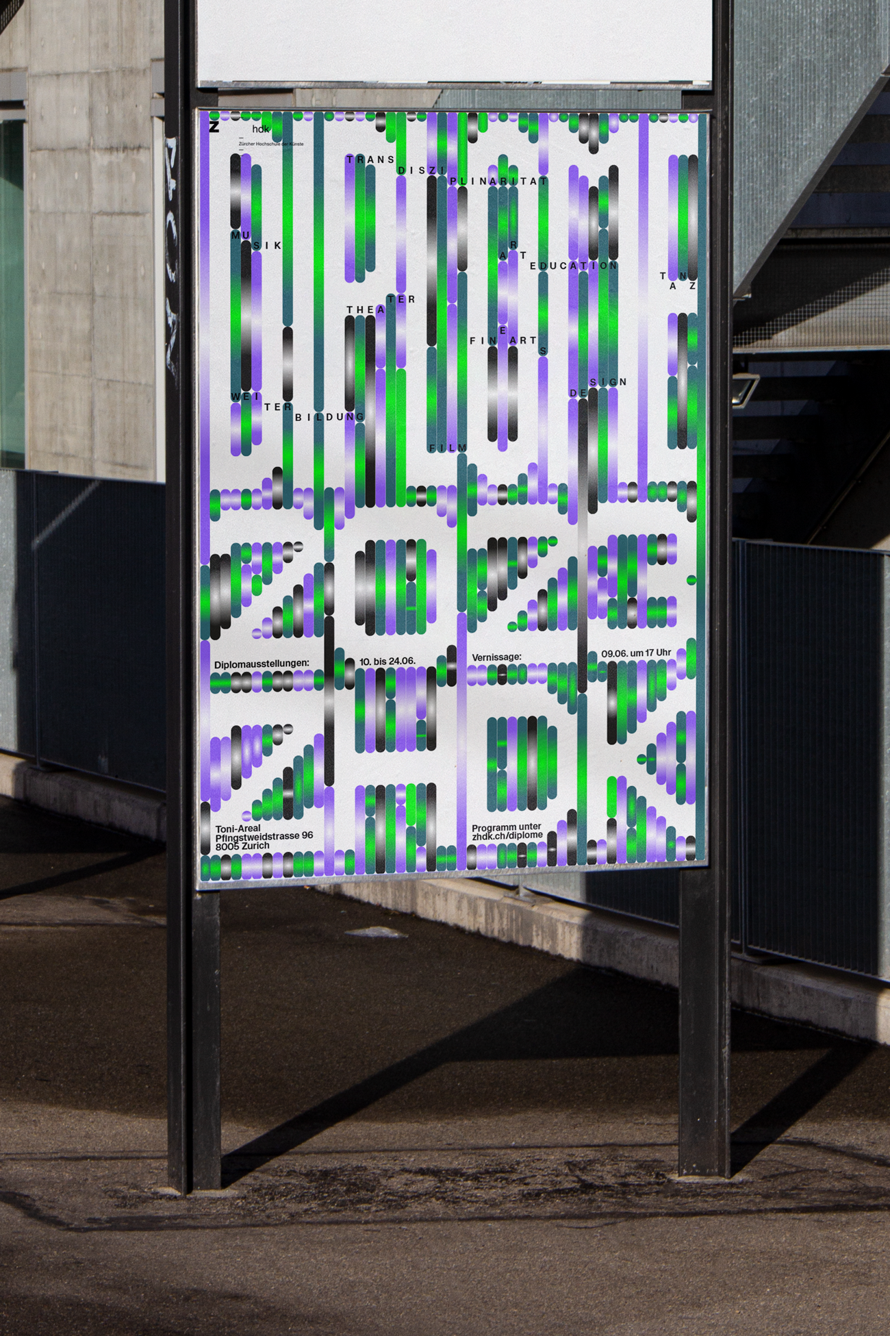


The design for the ZHdK diploma exhibition is completely renewed every four years. This year, we entered the pitch competition with a concept celebrating the interconnectedness of ZHdK's various programmes. Our design highlights the interdisciplinary approach that brings together different fields of study to provide a holistic art education.
Additionally, we developed a custom typeface based on our grid system, allowing for a flexible and modular design that adapts seamlessly across different formats.
In cooperation with Eleonora Bonorva and Elena De Carlo
Additionally, we developed a custom typeface based on our grid system, allowing for a flexible and modular design that adapts seamlessly across different formats.
In cooperation with Eleonora Bonorva and Elena De Carlo
Was blüht denn da? – Kalender 2023
Illustration
2022
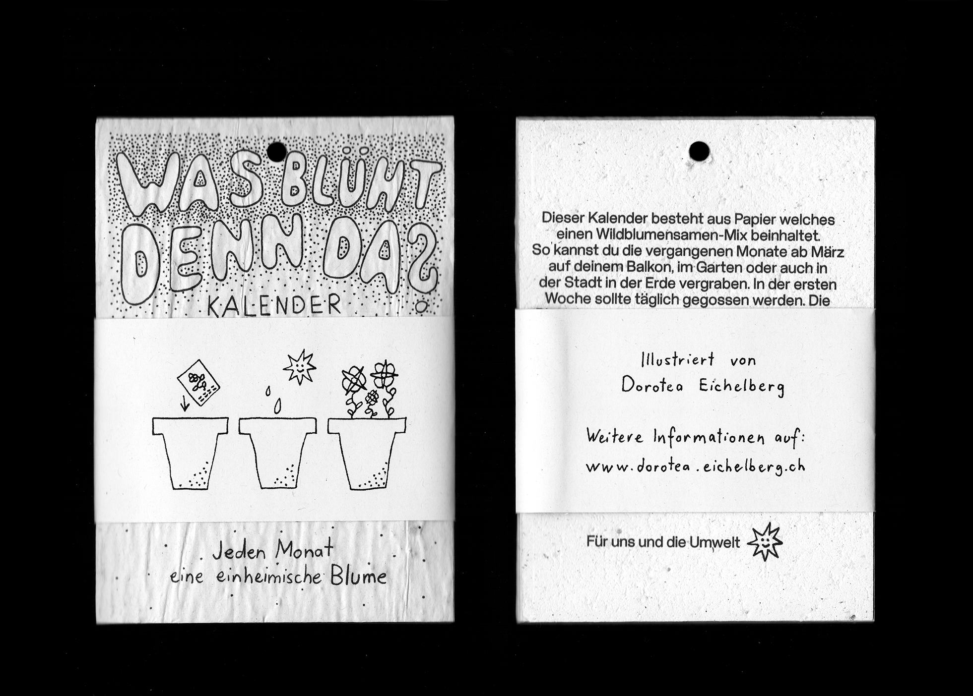


This calendar is made from handmade recycled paper embedded with wildflower seeds. Illustrated and assembled by hand, it goes beyond the typical 365-day lifespan by encouraging users to plant it, supporting local biodiversity.
Produced by the social enterprise Growing Paper, the paper comes from a South African project, while printing and logistics are handled in Bern, Switzerland. All prints are "Printed in Switzerland," helping to create jobs for people with disabilities
Produced by the social enterprise Growing Paper, the paper comes from a South African project, while printing and logistics are handled in Bern, Switzerland. All prints are "Printed in Switzerland," helping to create jobs for people with disabilities
Rethink Masculinity
Illustration
2022
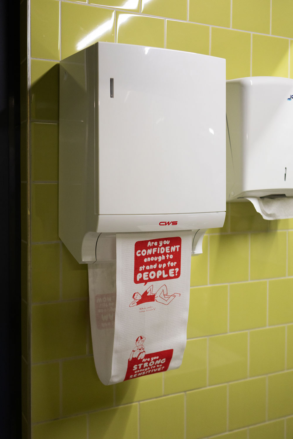
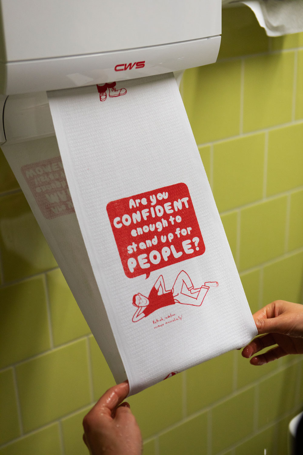
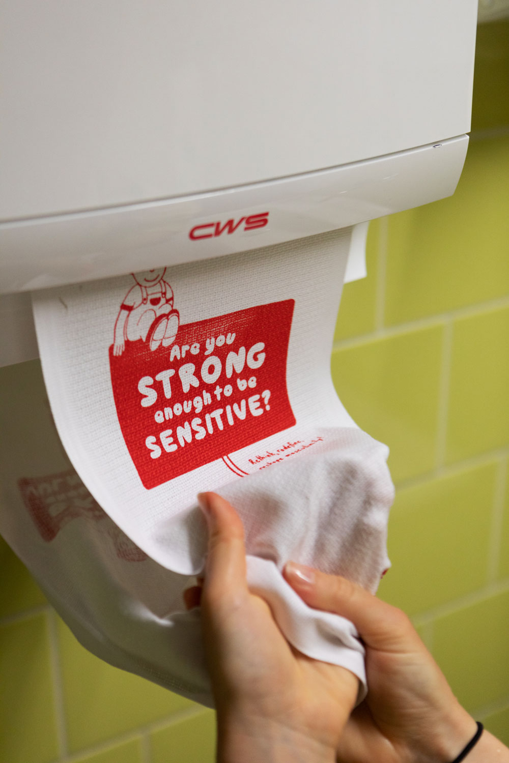
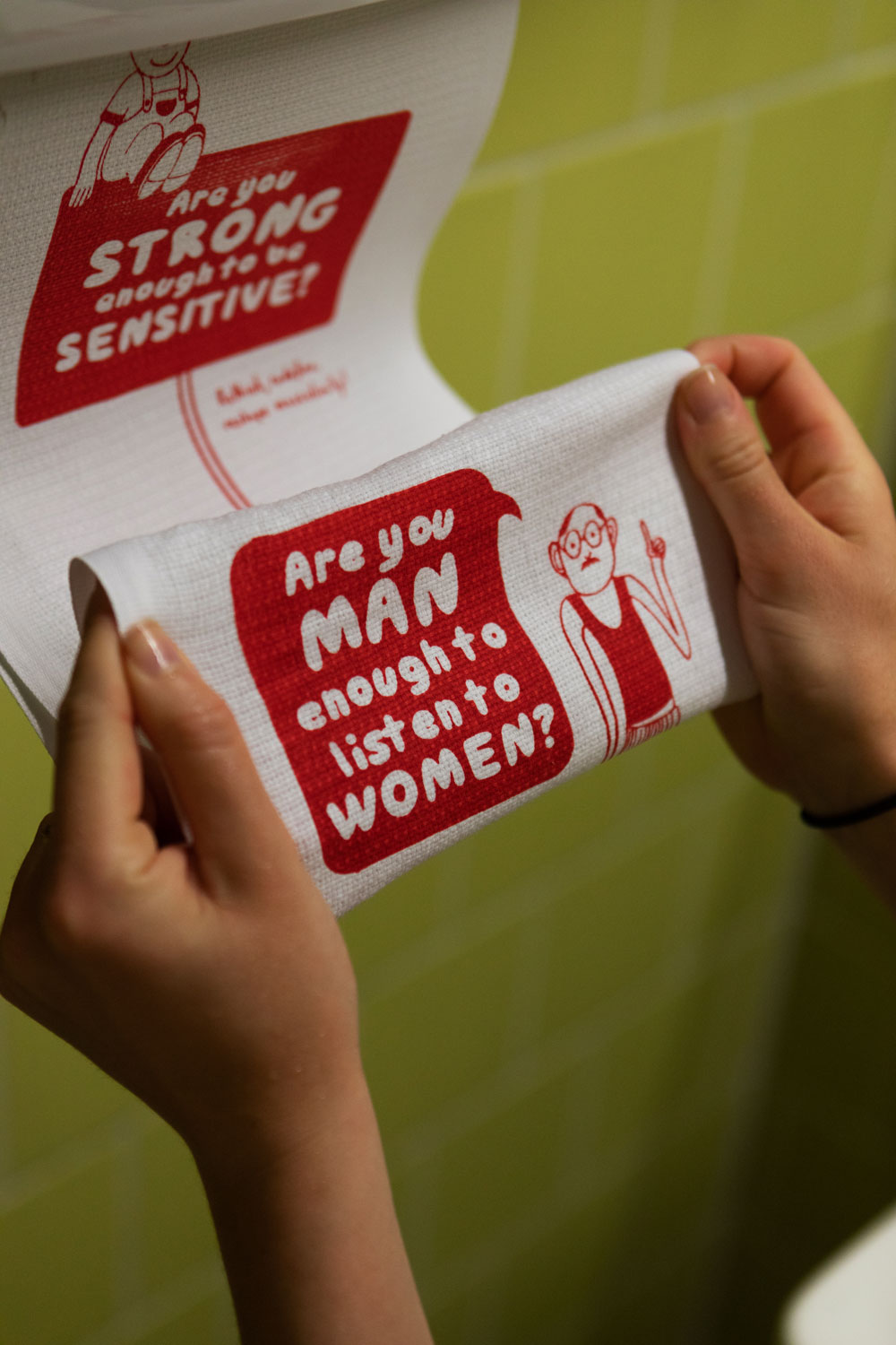
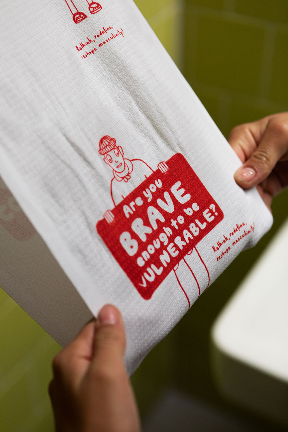
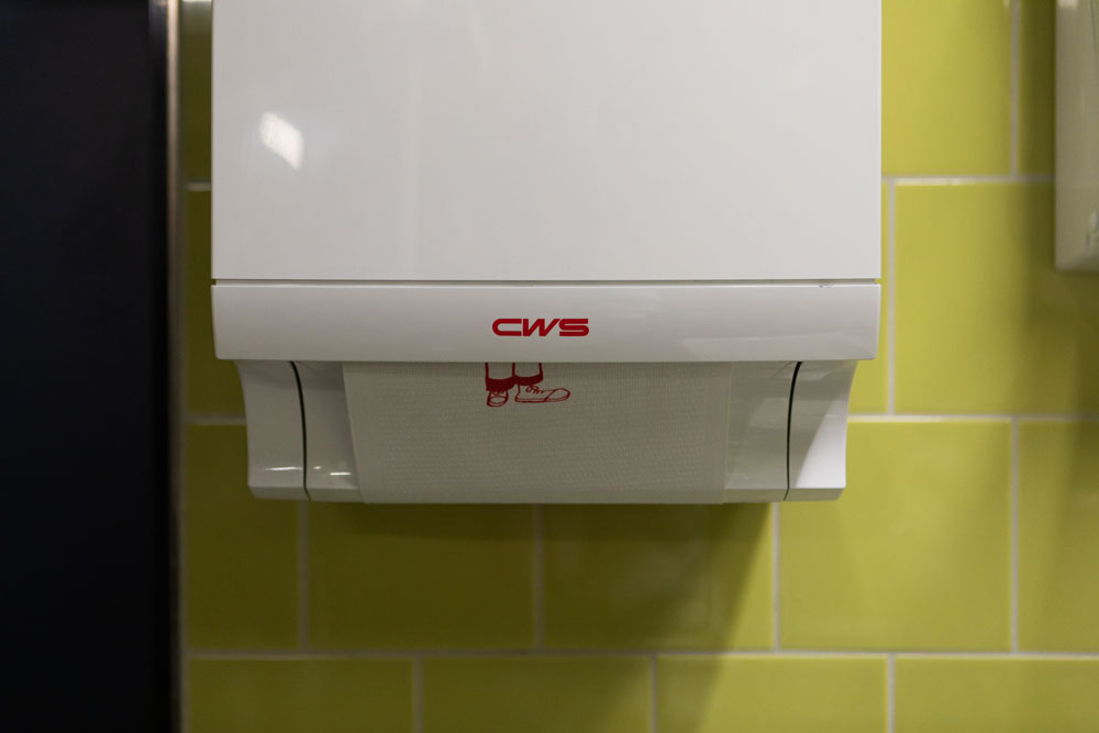
This project encourages viewers to rethink traditional concepts of masculinity. Installed in a urinal and screen printed on a towel roll, it challenges everyday spaces and prompts reflection on gender norms in unexpected places.
Nicolai Shoes
Photography
2021


This is a thoughtfully conceptualised and executed photo series created for
Nicolai Shoes. The series showcases the intricacies and character of each shoe, blending aesthetic storytelling with a distinct visual identity.
Teoflowers
Illustration
2021
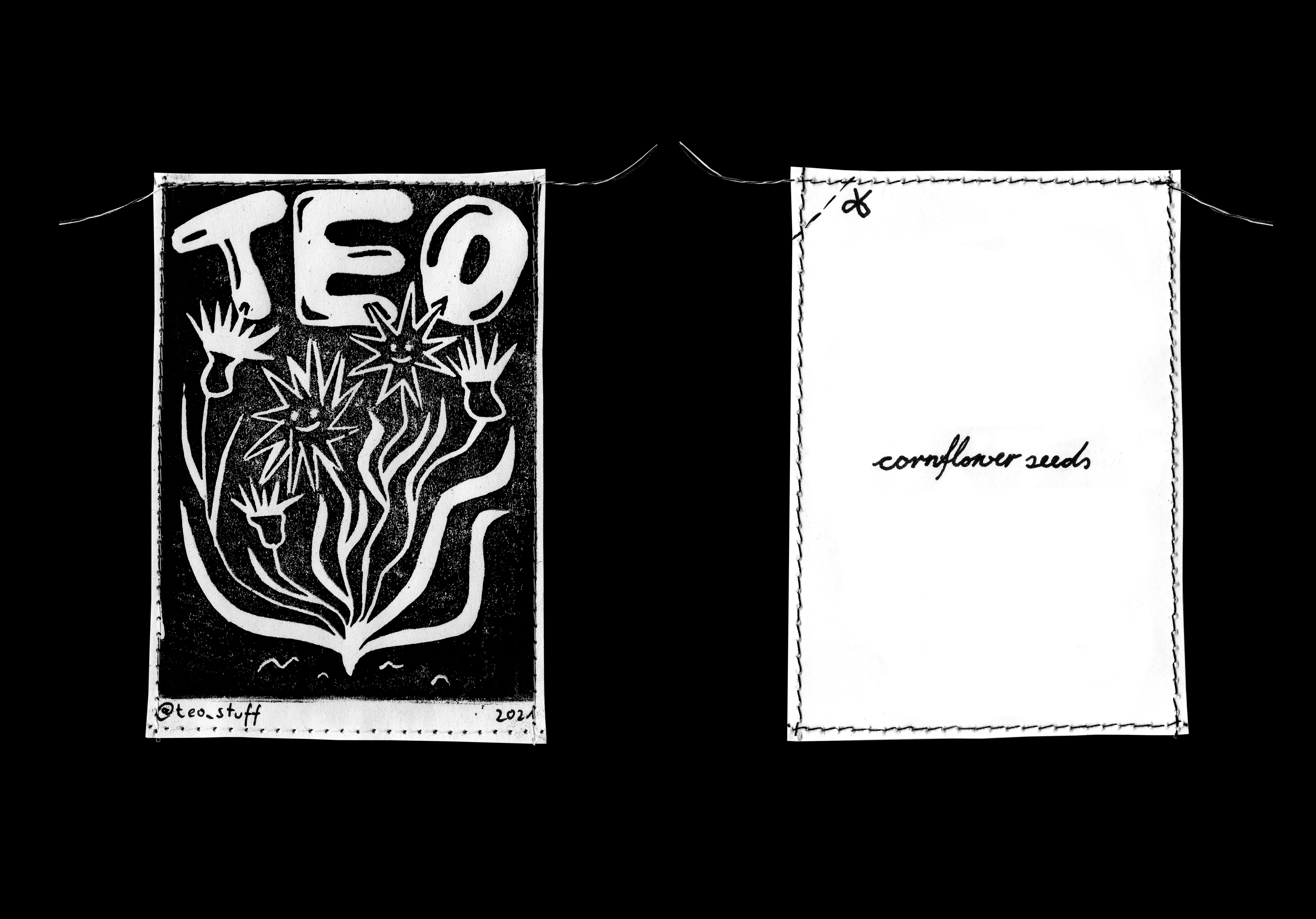
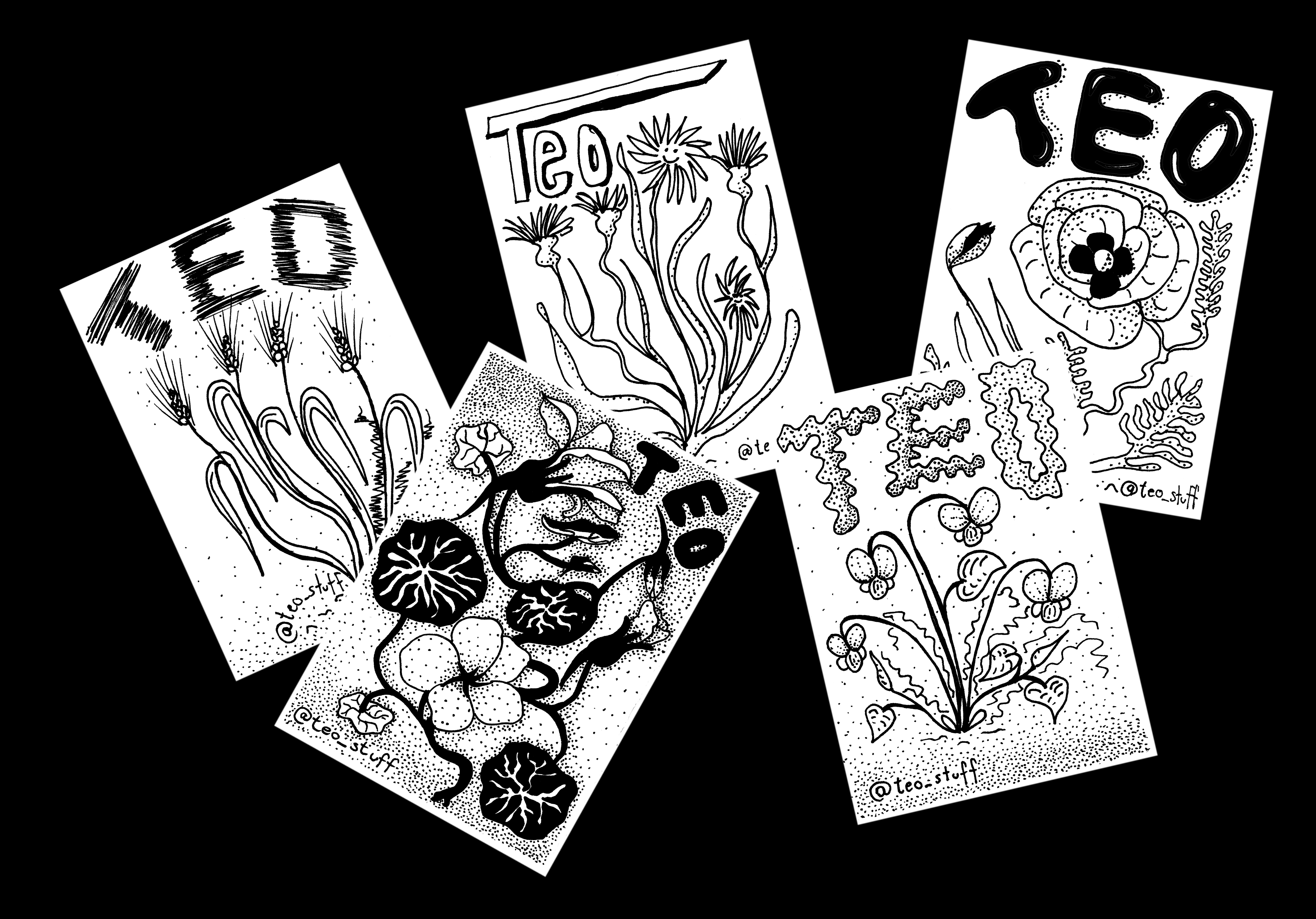
Design for my Teoflower seeds that I cultivate on my balcony. Implemented with linoleum print. For you and the bees!
More on Instagram
@teo_stuff
More on Instagram
@teo_stuff
Kultur im Quadrat
Posterdesign
2021
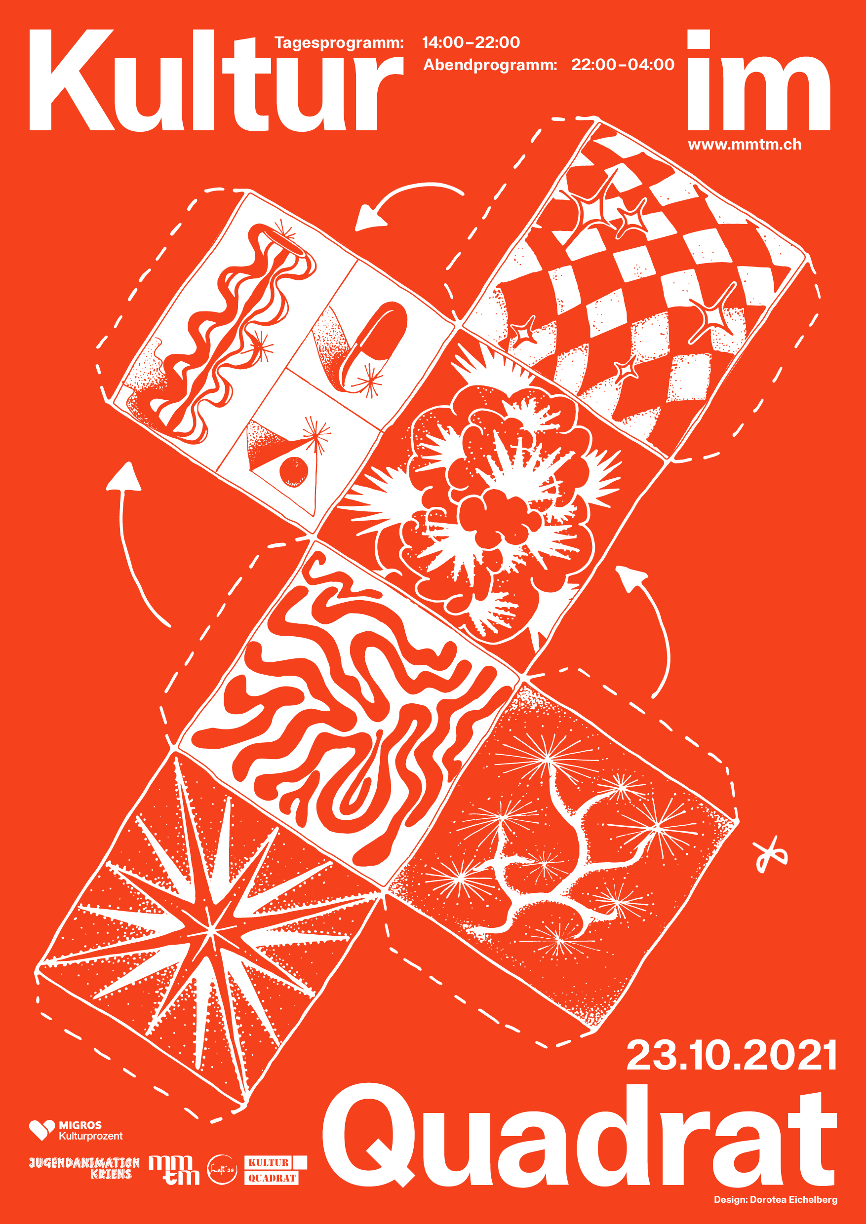
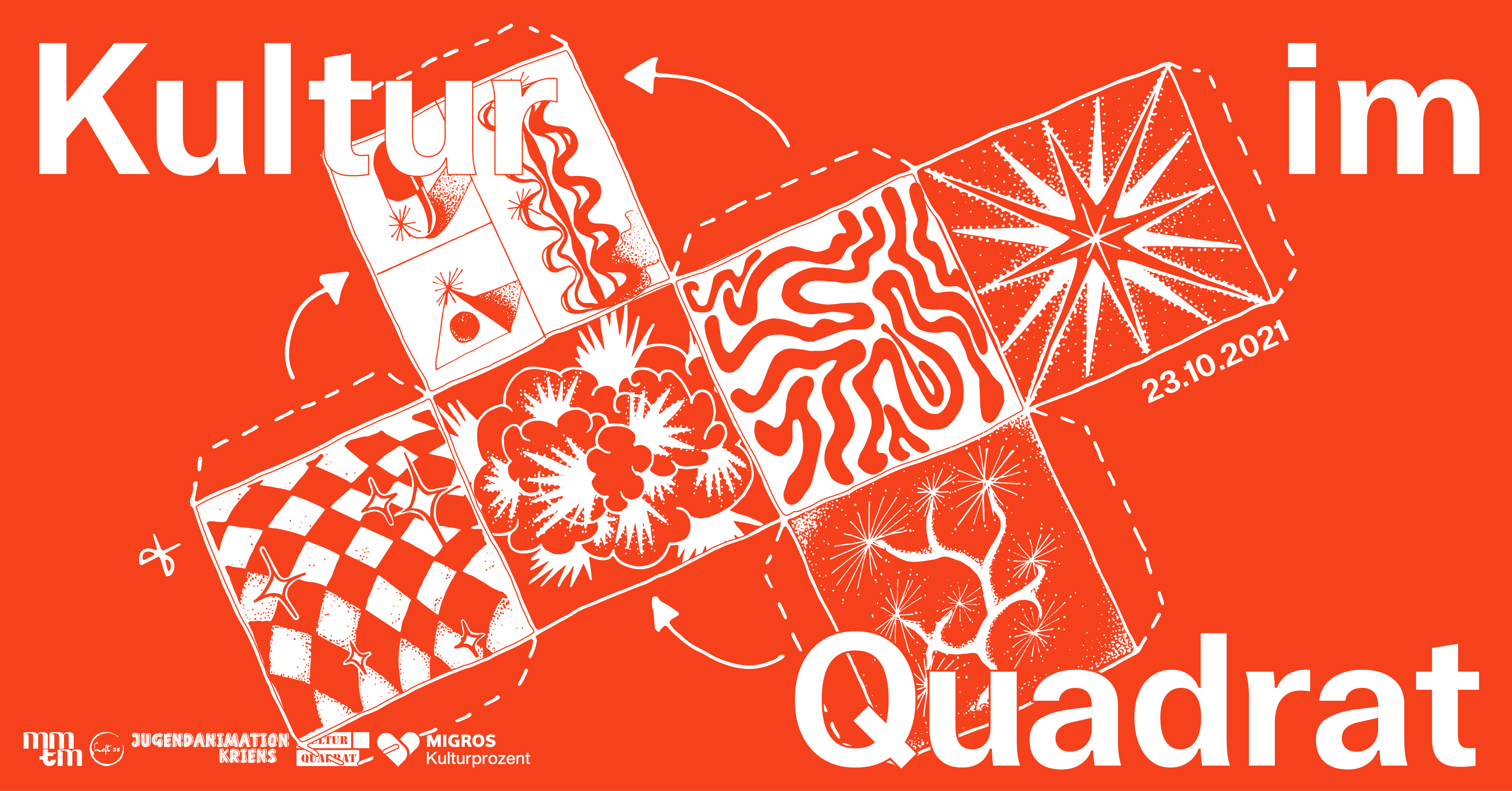
Design for the art event Kultur im Quadrat, organized by Momentum an event collective from Lucerne. By planning and organizing events, they pursue the goal of being able to provide a cultural alternative.
More on Instagram
@mmtm.ch
or Facebook
@mmtmch
More on Instagram
@mmtm.ch
or Facebook
@mmtmch
TEO
Brand Identity
2021
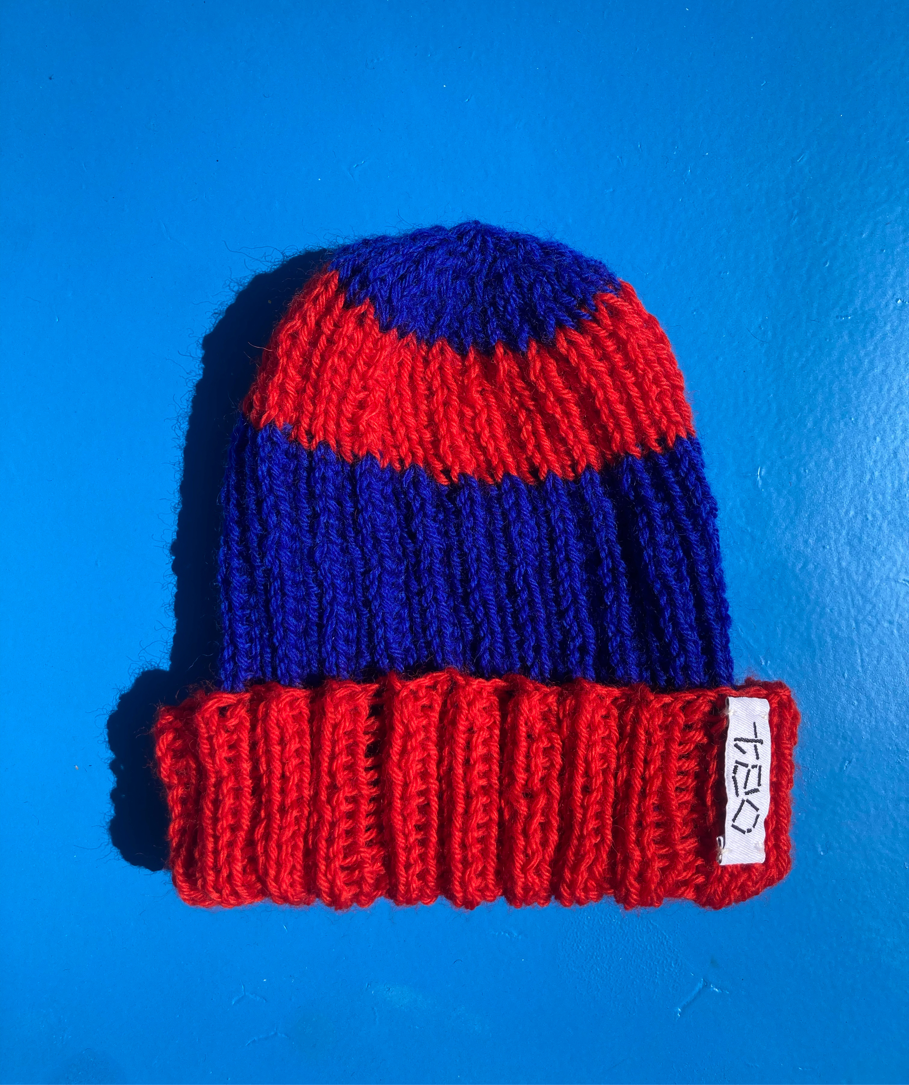

TEO is my interdisciplinary design lab that is about creating and engaging with projects that are handmade, ethical and sustainable. It’s about treasuring each unique piece and the time and effort that goes into it. Slow Design made with passion & care.
More on Instagram @teo_stuff
Logo design by Raphael Wicki
More on Instagram @teo_stuff
Logo design by Raphael Wicki
Ersatzmasken bauen.
Editorial
2021
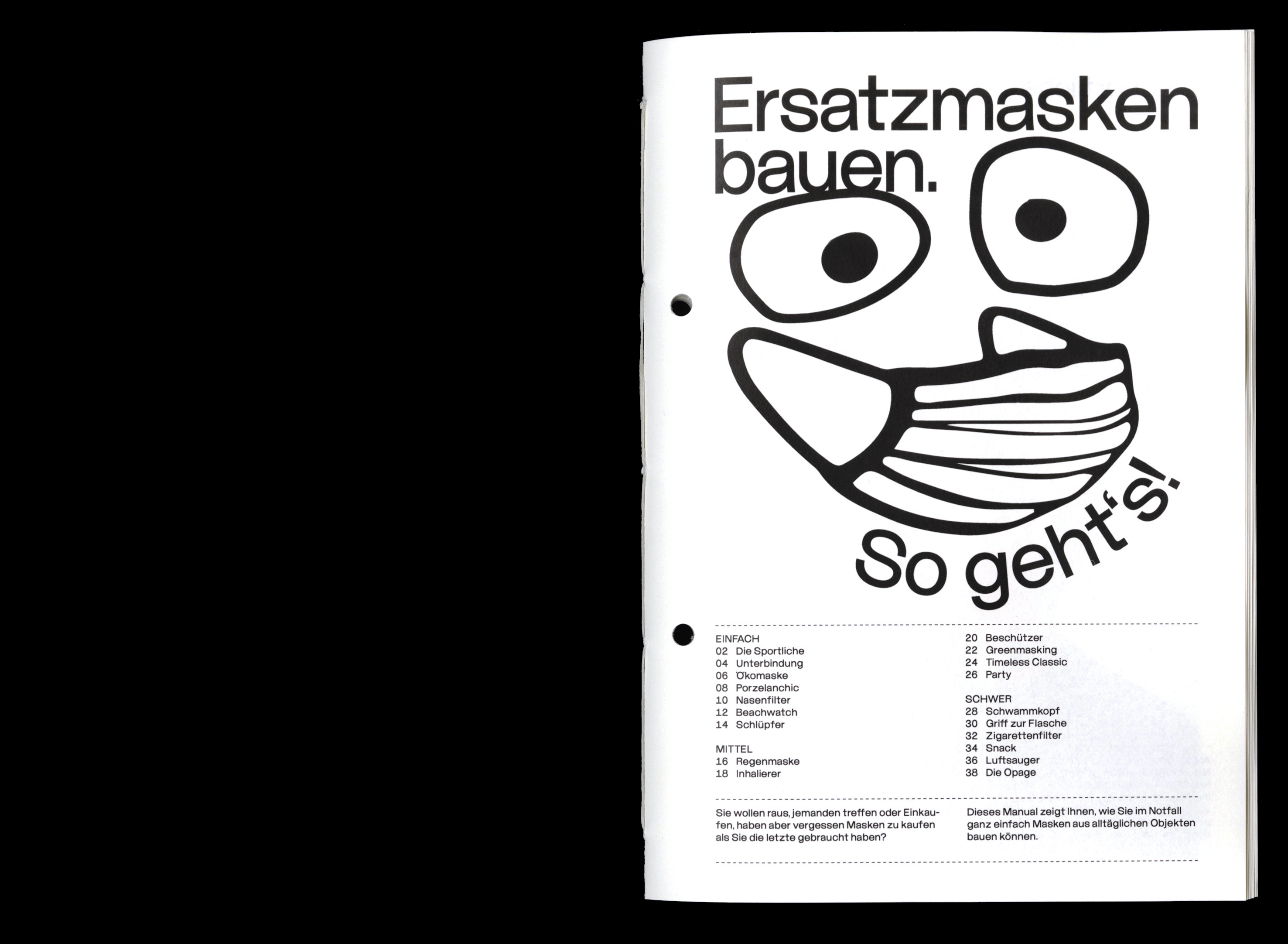
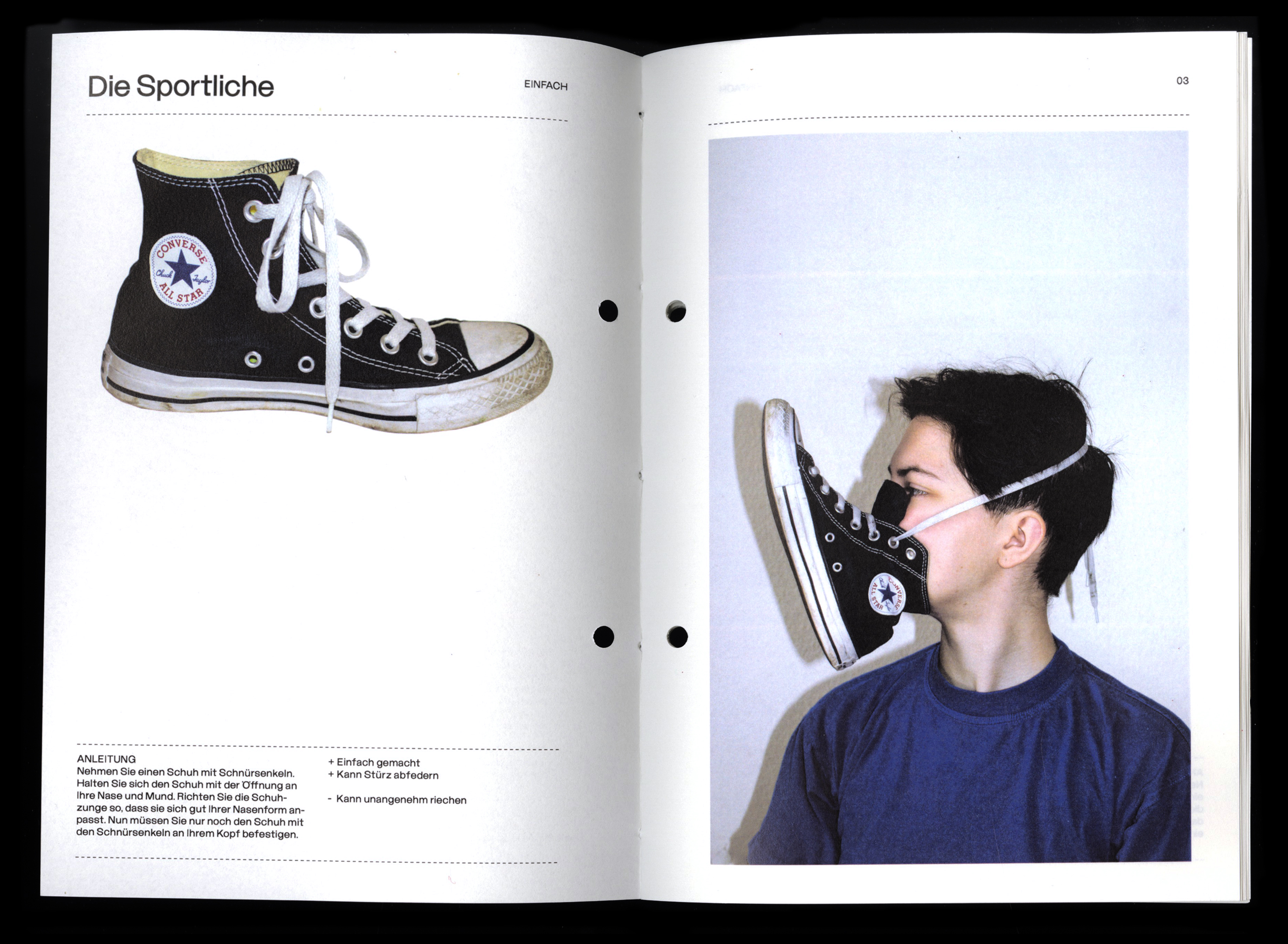


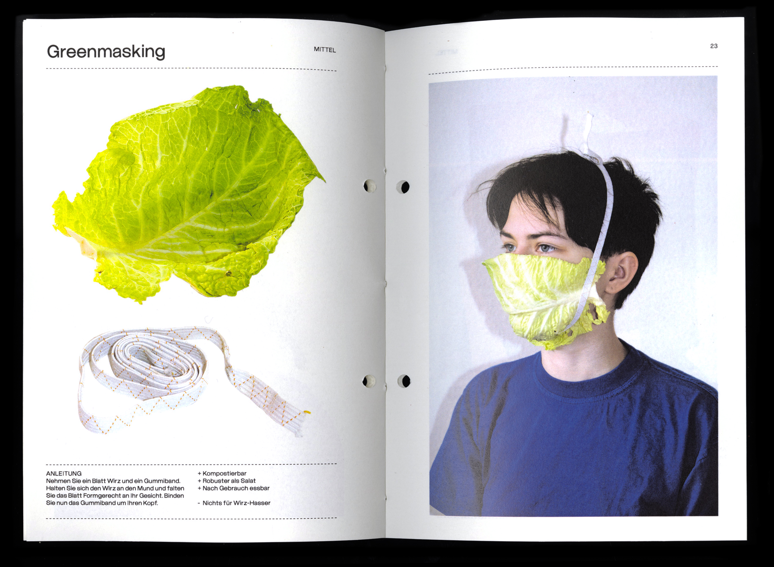
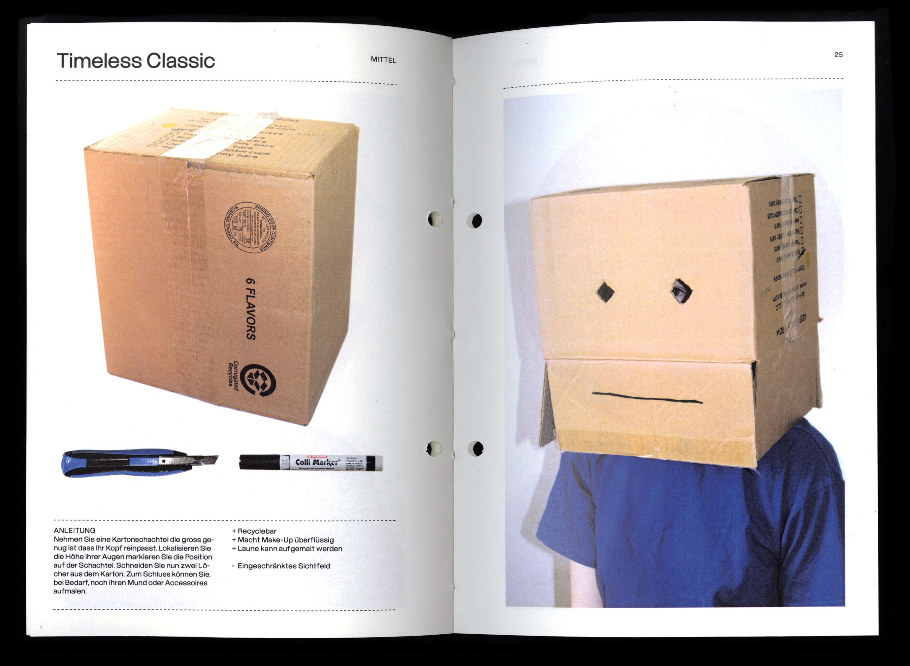


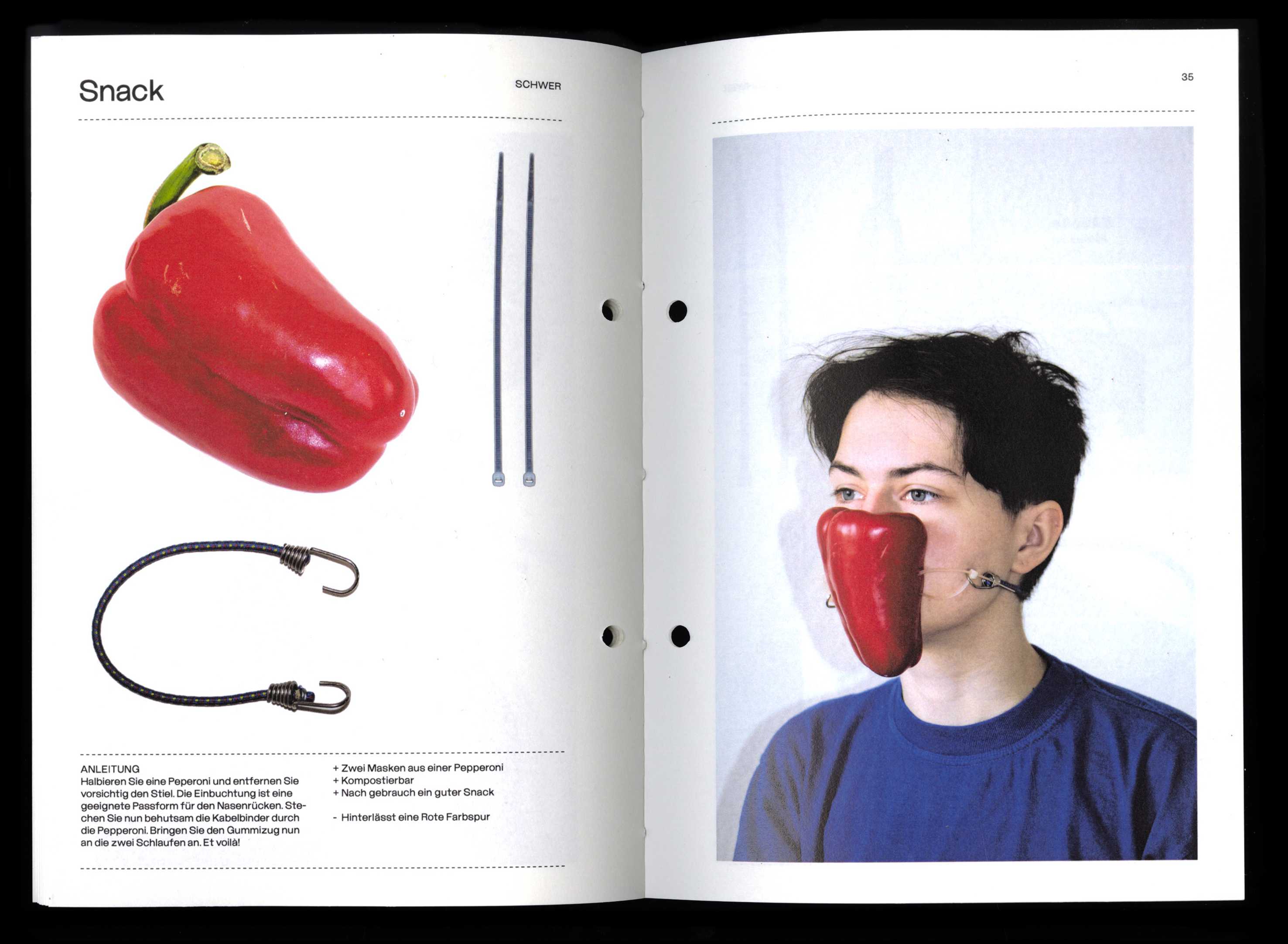
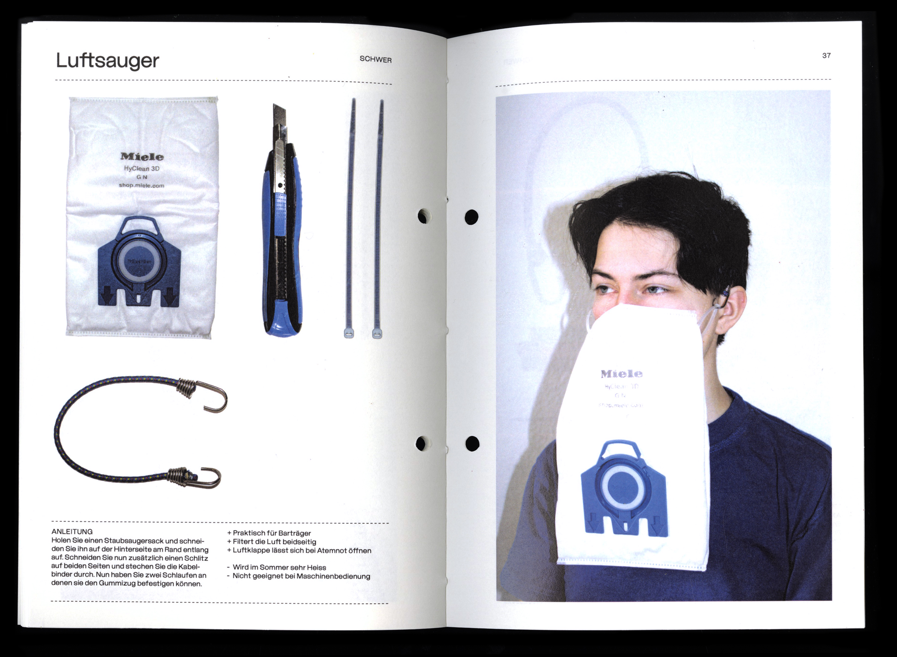
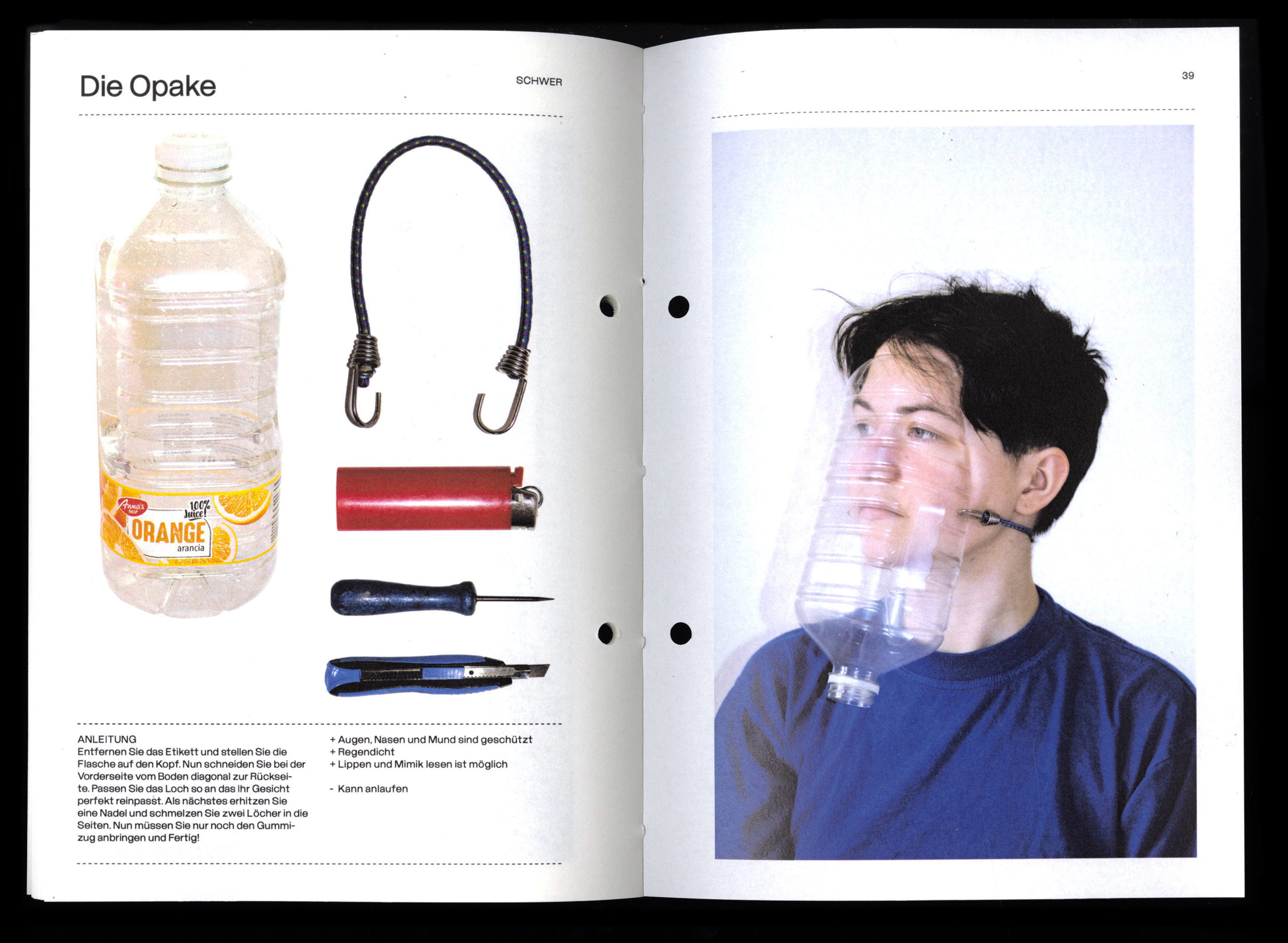
At the moment it is difficult to maintain physical contact with the outside world. If you have to go outside despite the Internet and delivery services, a mask is currently an absolute must to protect yourself and your contacts. But what if you last mask has just run out?
I have dealt with this question and created a manual that shows how you can build different emergency masks from everyday objects. The masks are divided into different levels of difficulty and all have certain advantages and disadvantages.
I have dealt with this question and created a manual that shows how you can build different emergency masks from everyday objects. The masks are divided into different levels of difficulty and all have certain advantages and disadvantages.
Critical Mass Zürich 2021
Posterdesign
2020

Ni Una Menos
Posterdesign
2020


Halifax Zine
Illustration
2020
Wishlab inc.
Animation
2020


Luzerner Ferienpass
Posterdesign
2020
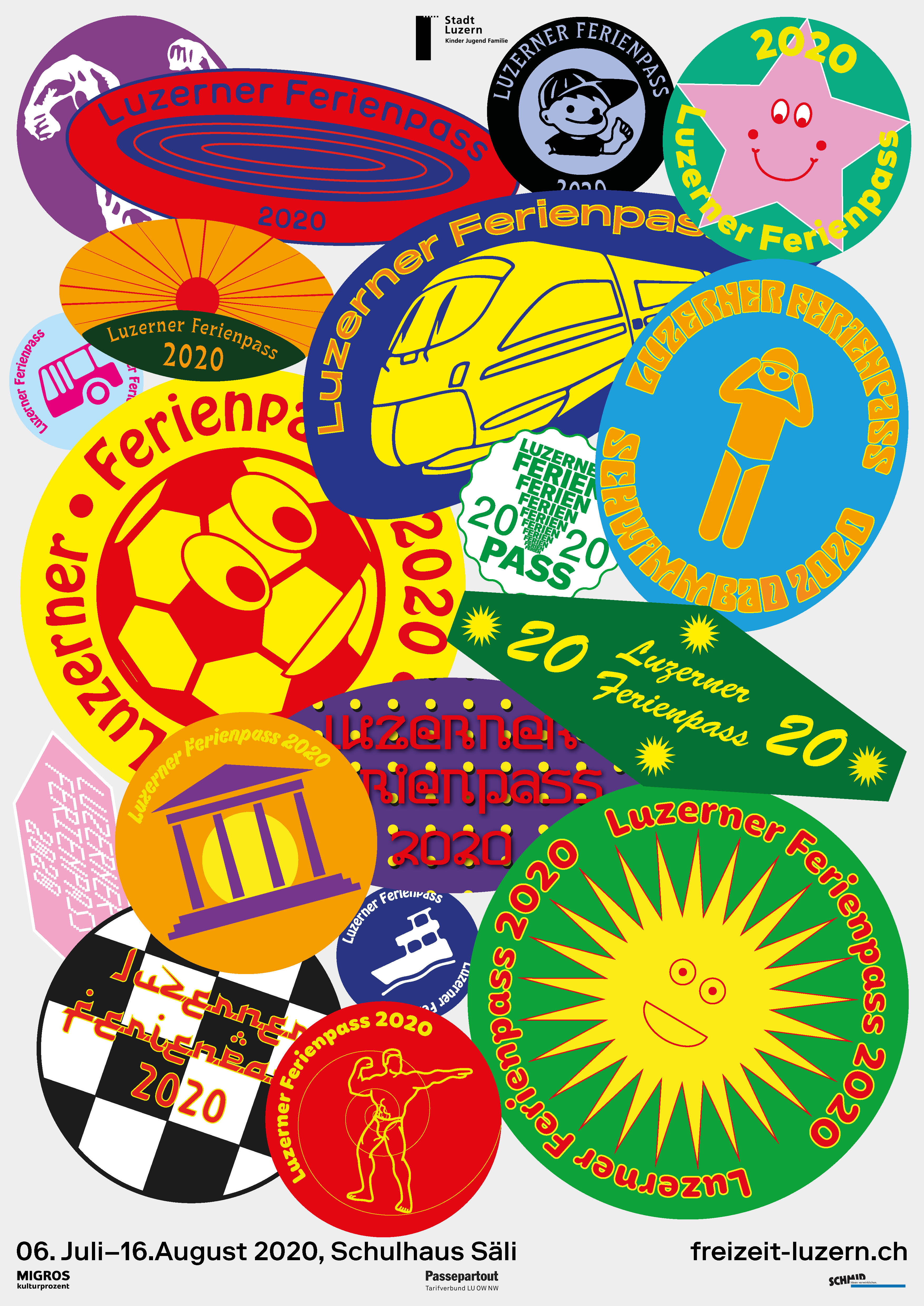
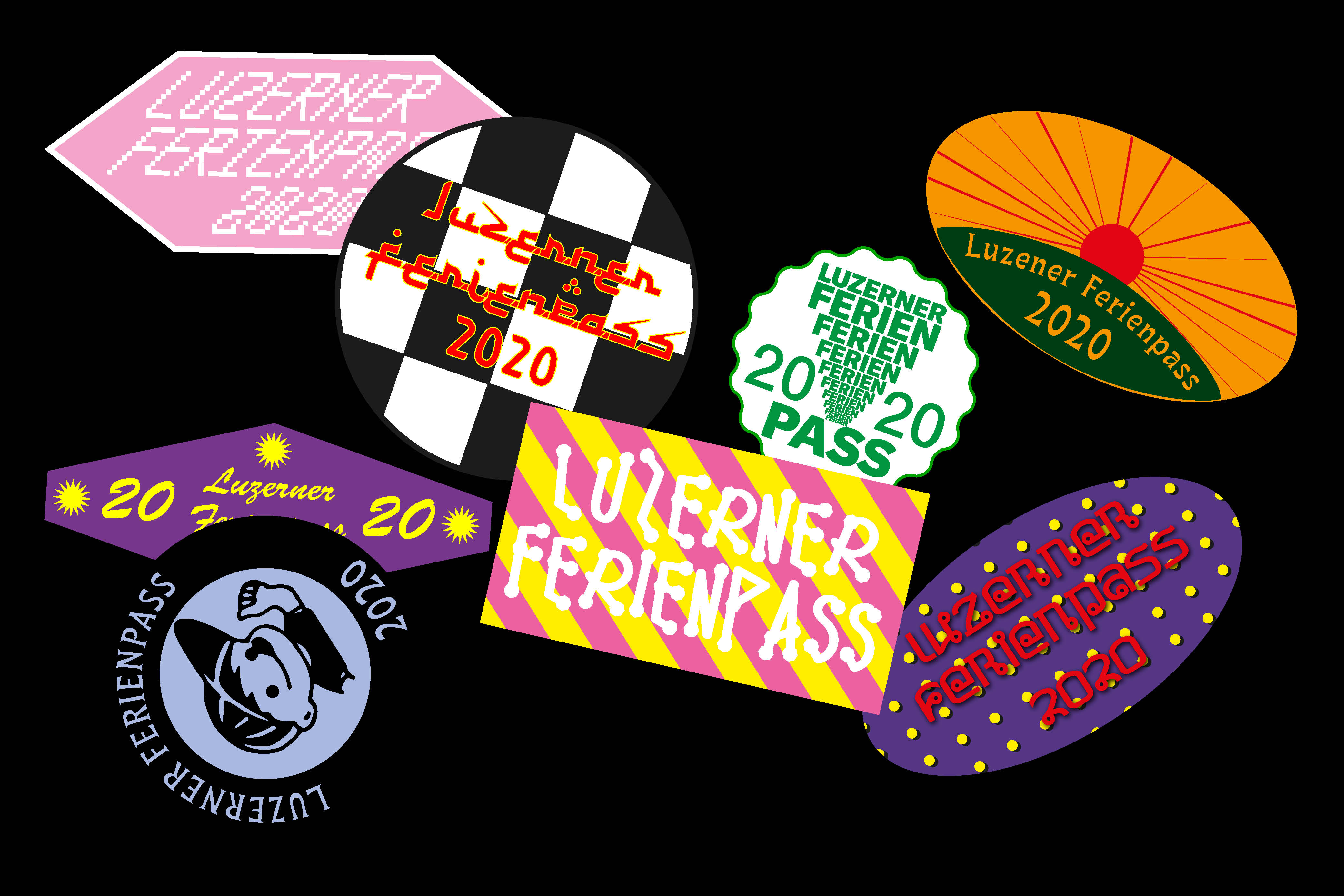
Poster design for the Luzerner Ferienpass 2020. The poster symbolizes a sheet where stickers for all the holiday-activities are collected. Just like the stamps in a passport.
NAWC
Web Design
2020

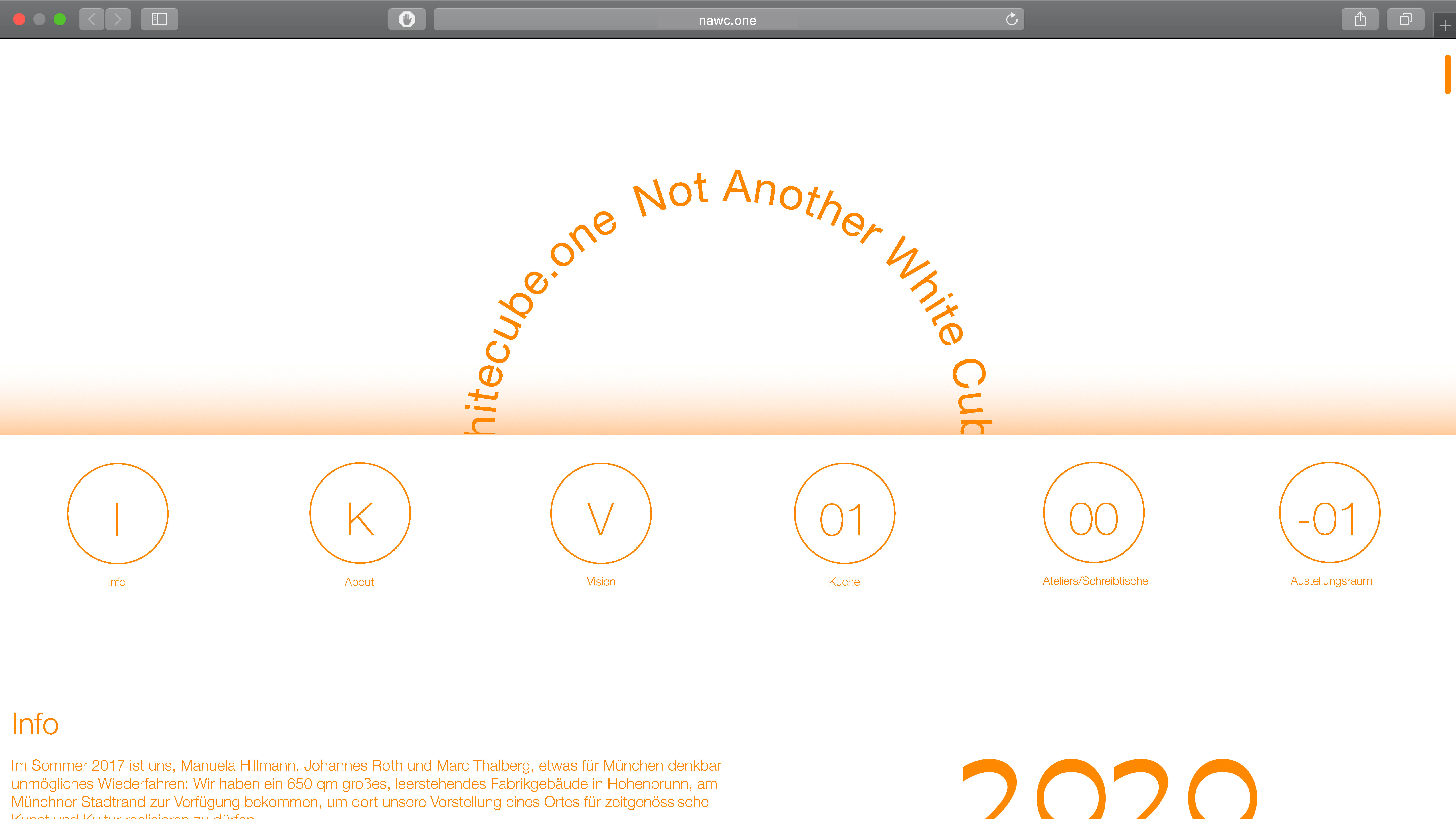


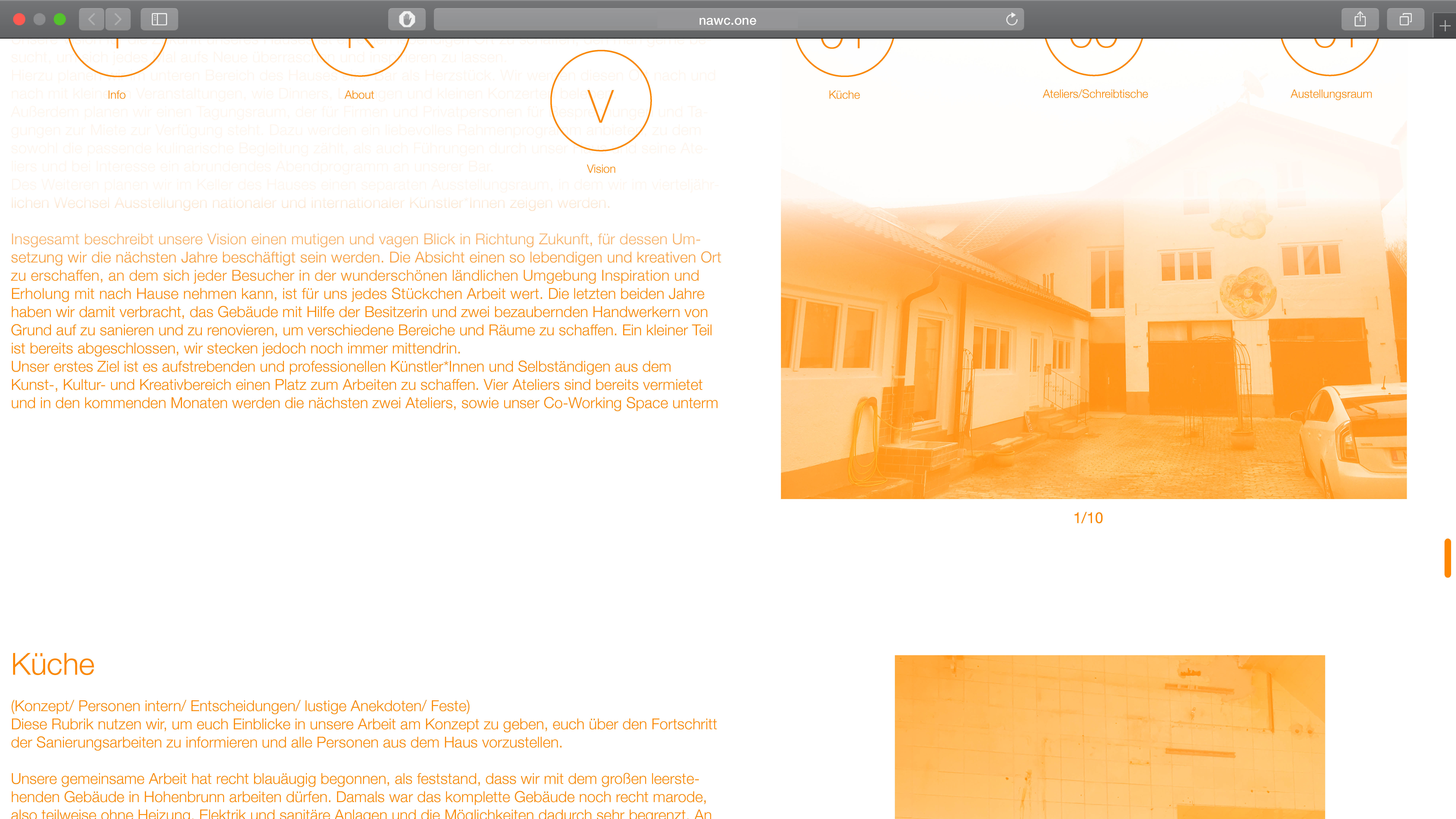


Website For NotAnotherWihteCube and their new Artist residency in Munich. NAWC is a place for artists to explore their work, featuring work and exhibition spaces.
Verschachtelungsdesign
Editorial
2019


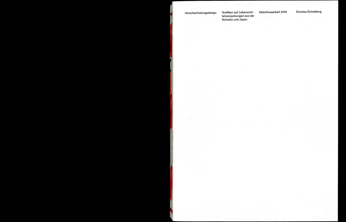
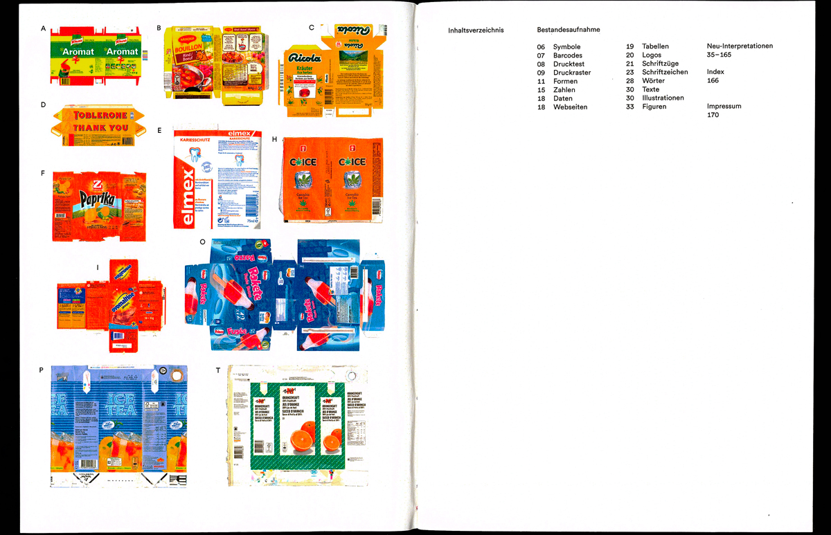
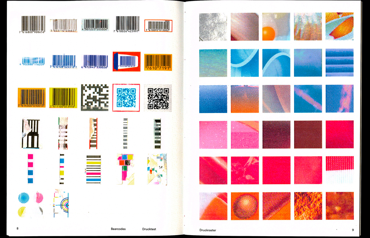
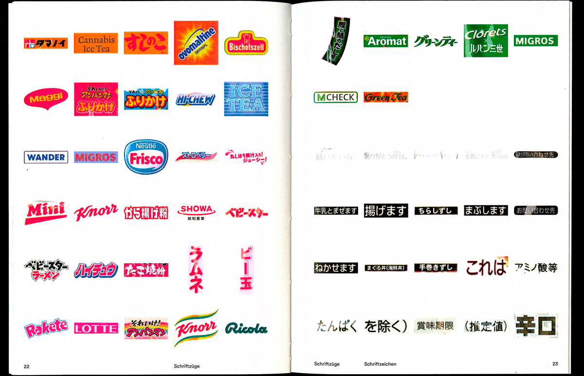
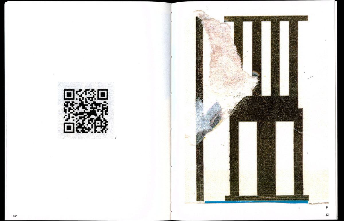
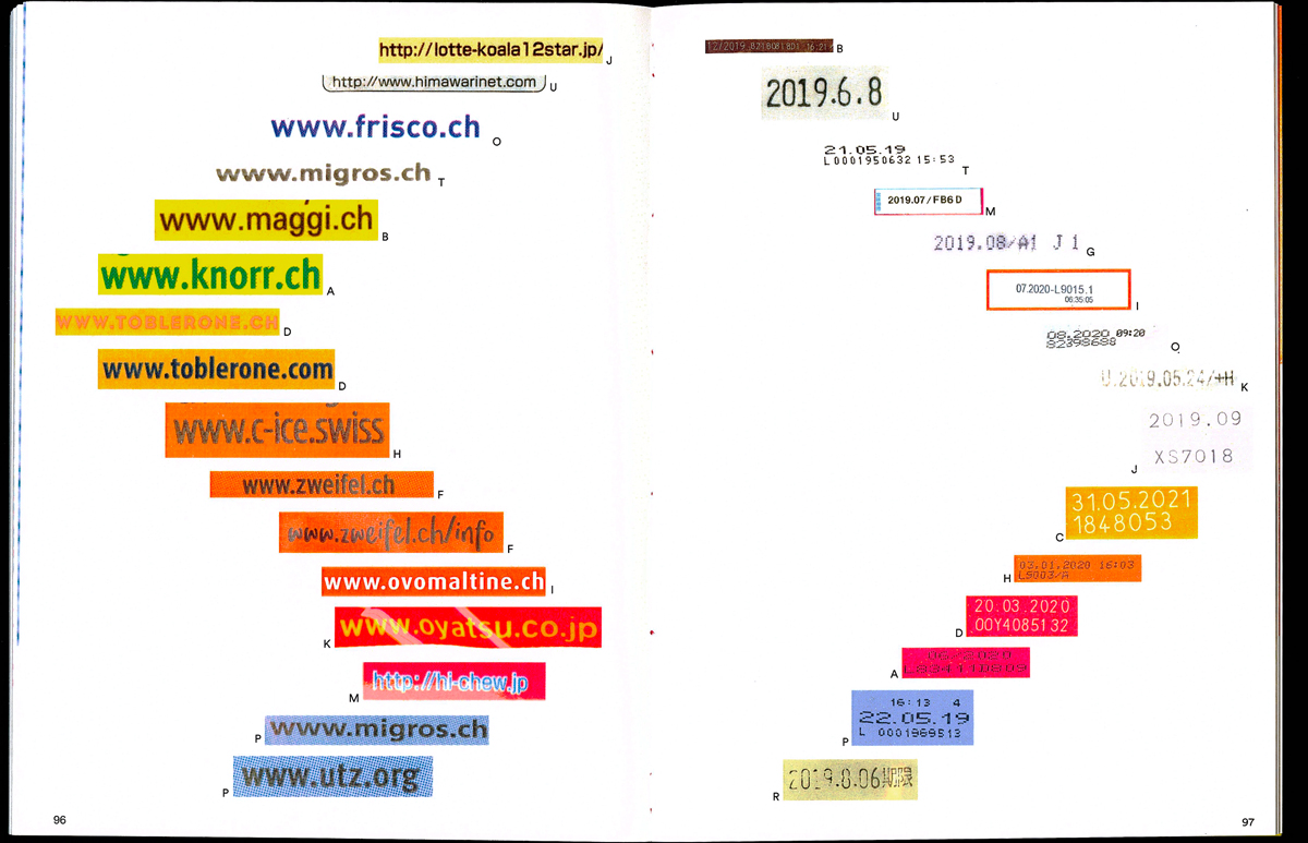
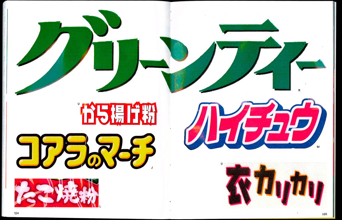
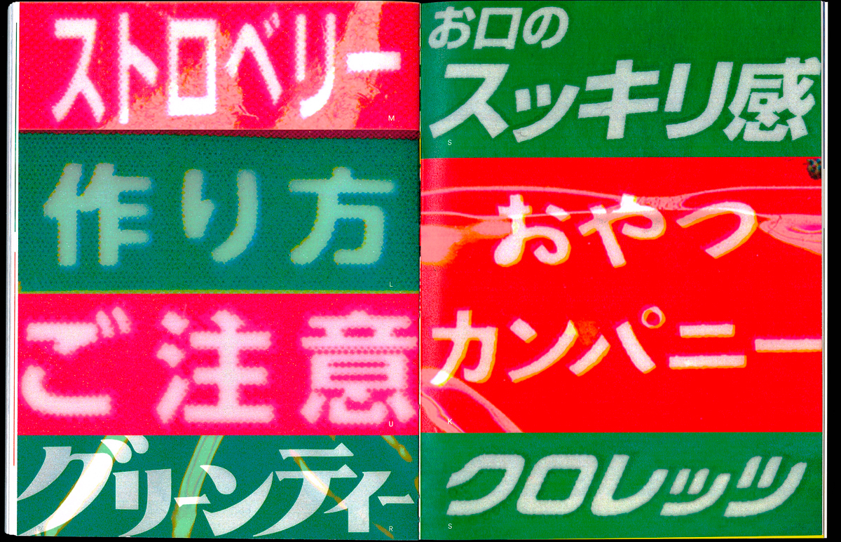
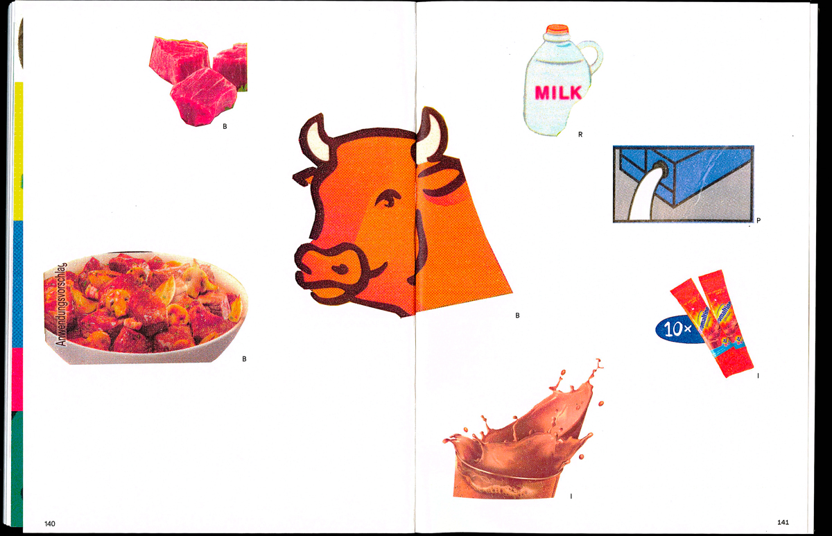
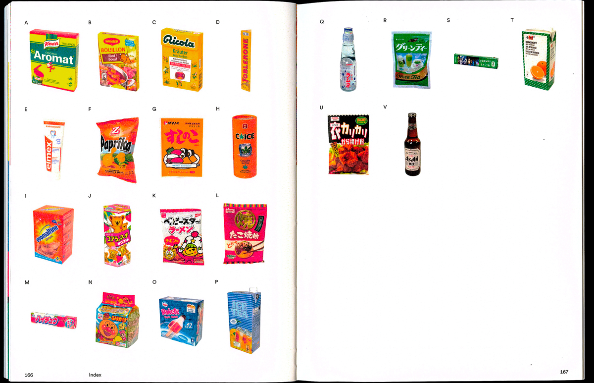
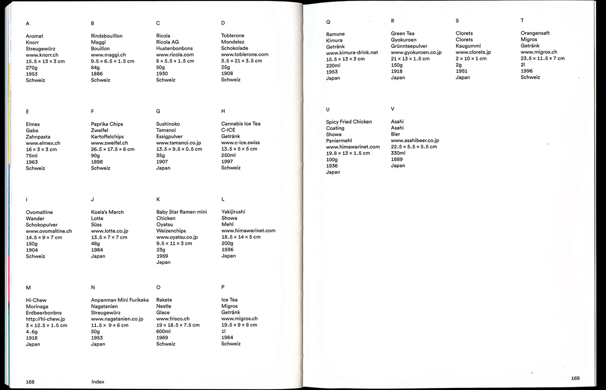
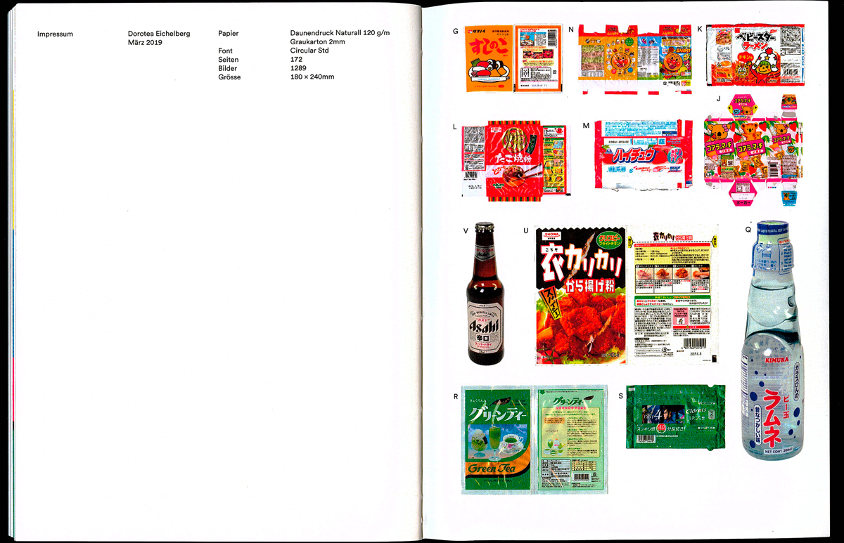
In my diploma project I dealt with packaging design of two cultures, Switzerland and Japan. The whole book is packed in a cardboard box, with the different parts that represent those two countrys.
Internship Report
Editorial
2018
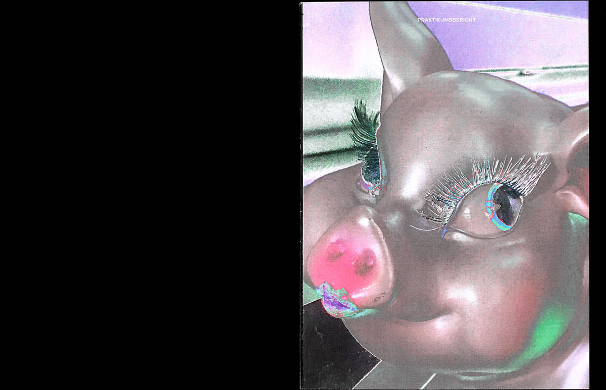
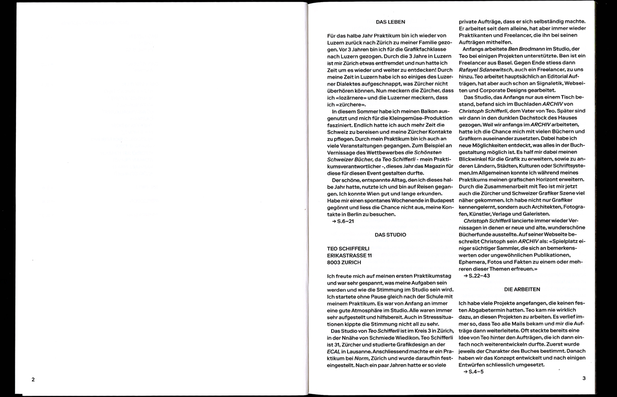
For my six-month internship at Teo Schifferli in Zurich, I have created a report summarizing everything I have experienced, learned and done. This report contains sketches, ideas and designs I did at the studio, as well as impressions from personal experiences I made during this half year.
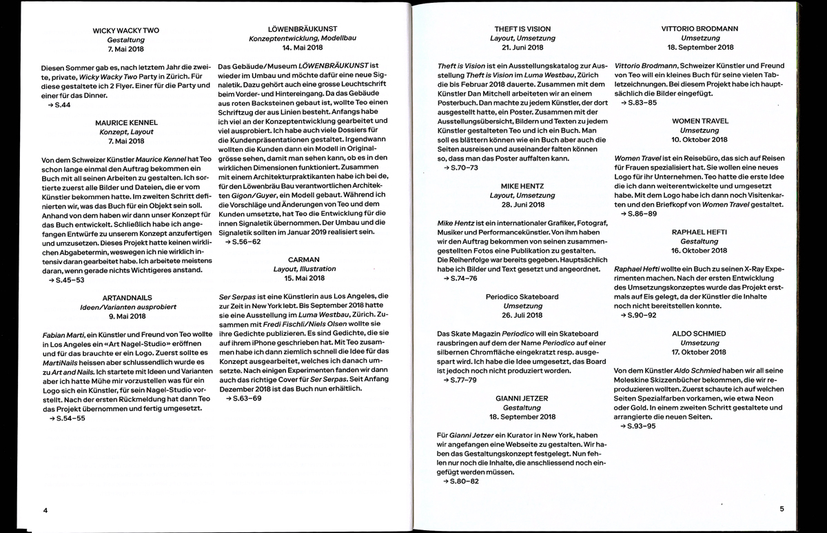
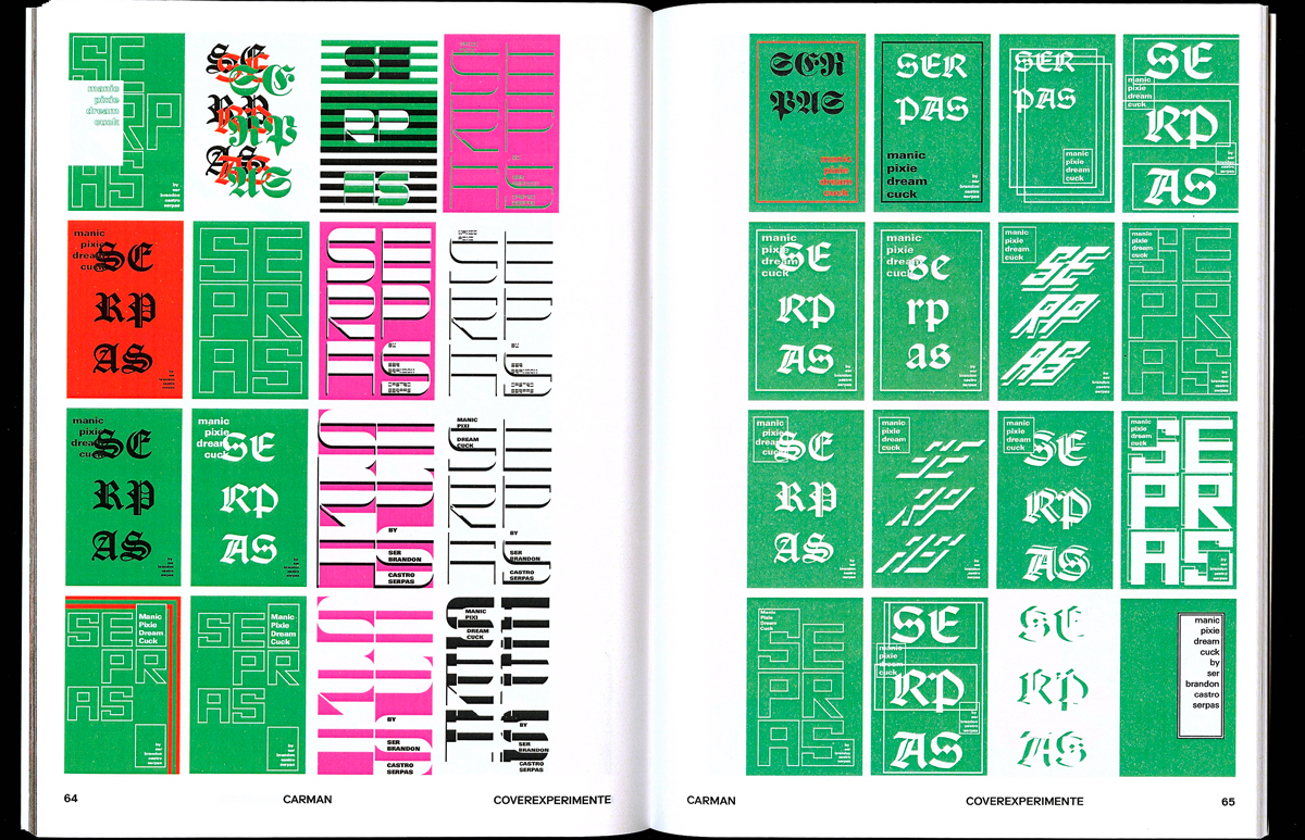
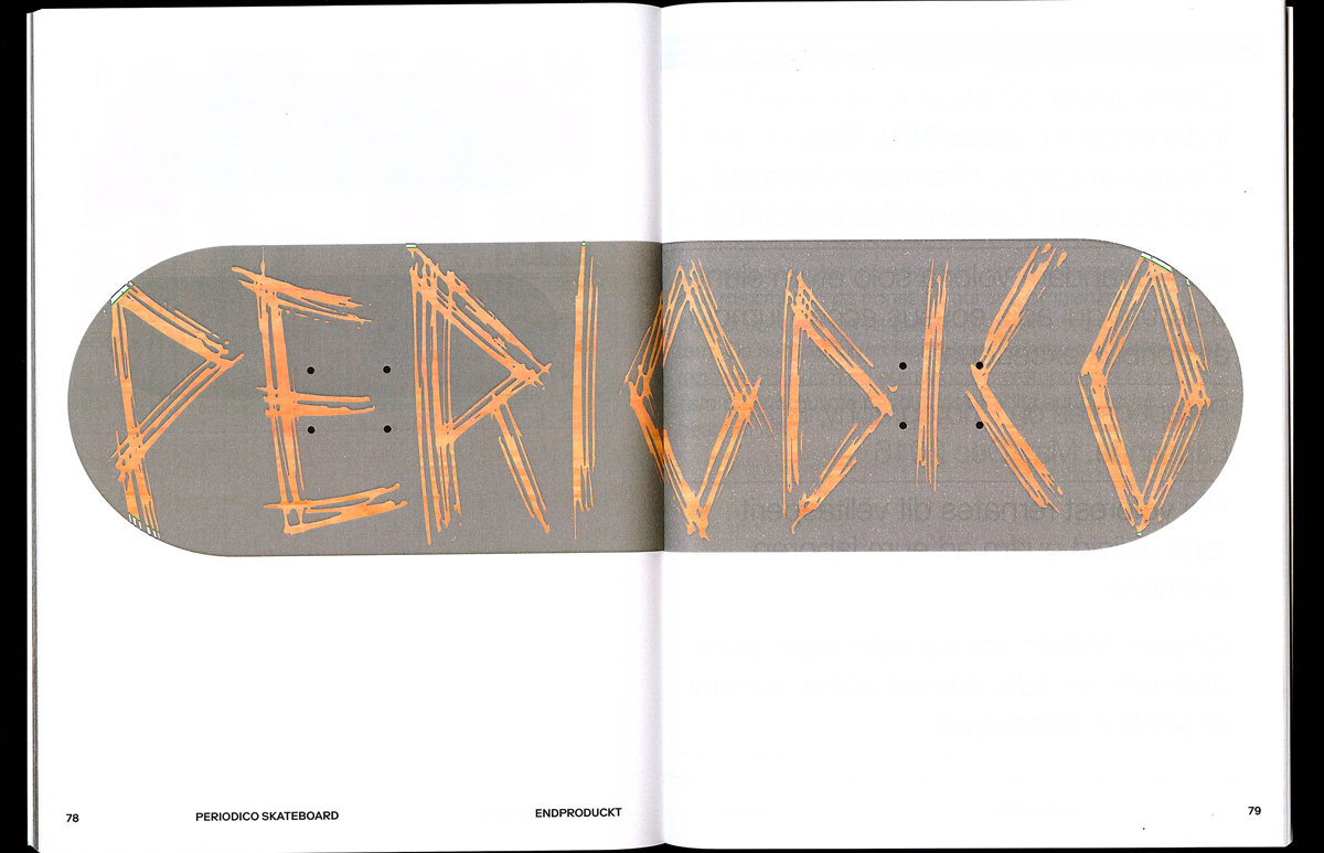
Carman
Editorial
2018
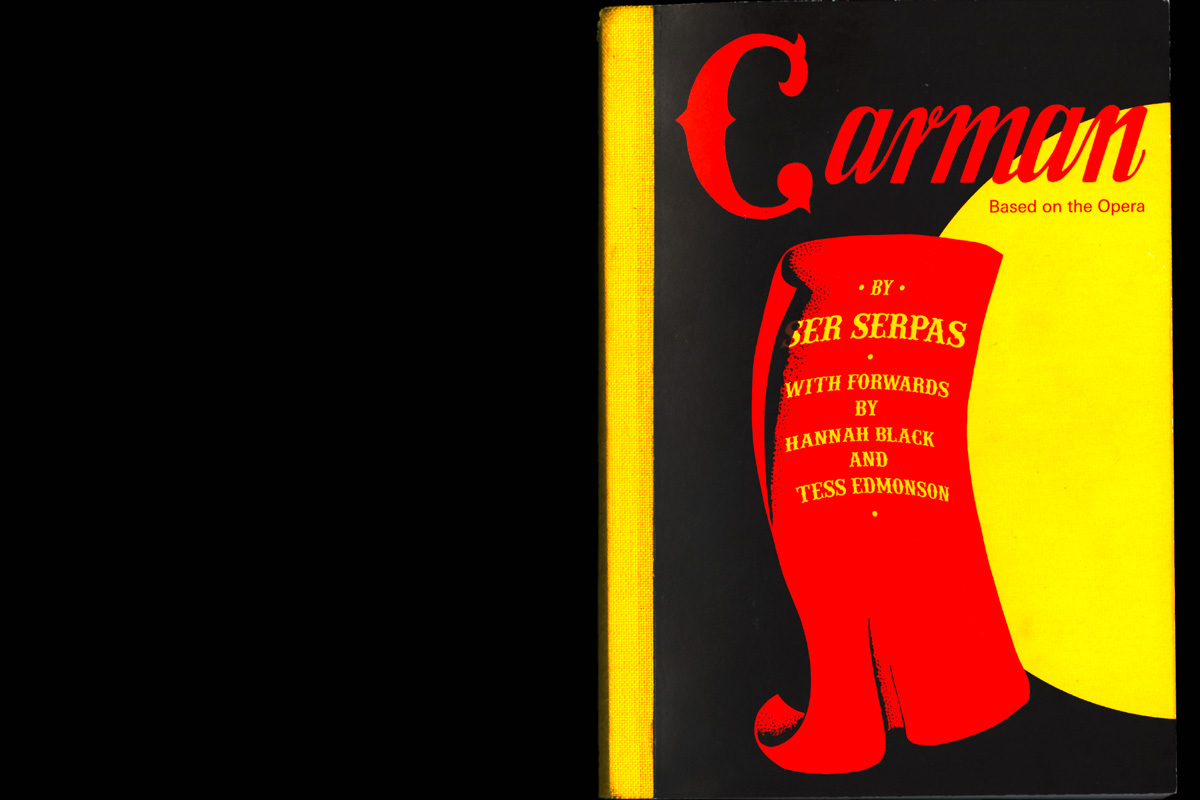
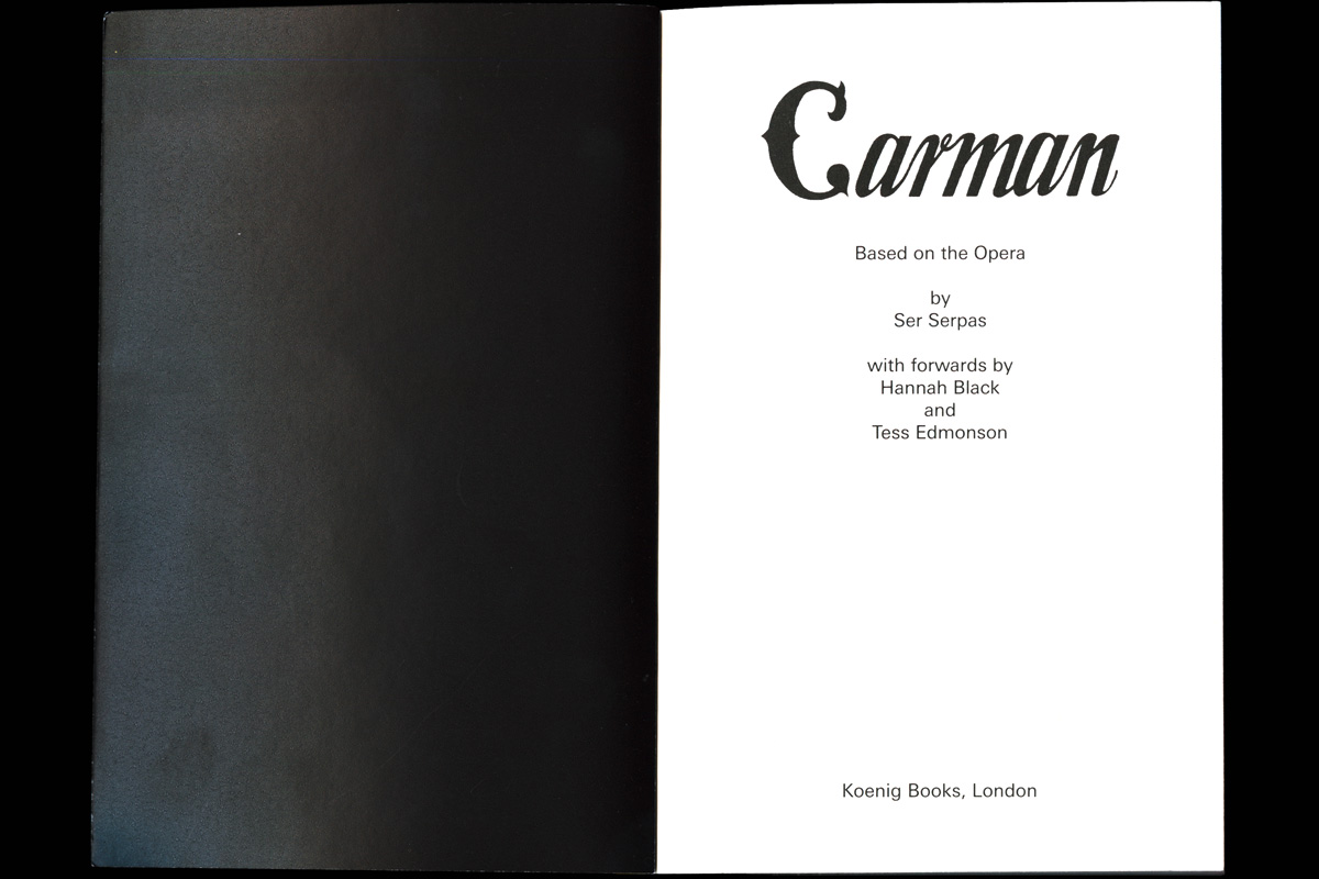
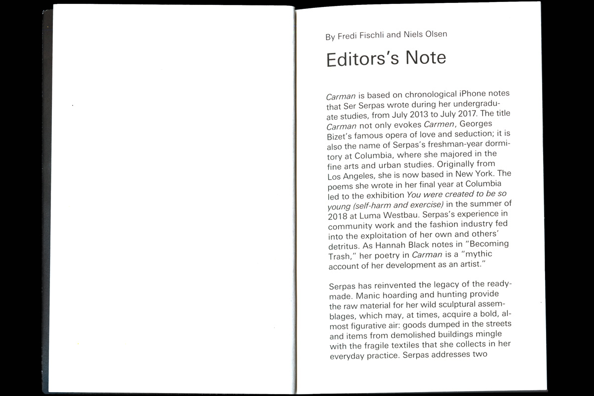
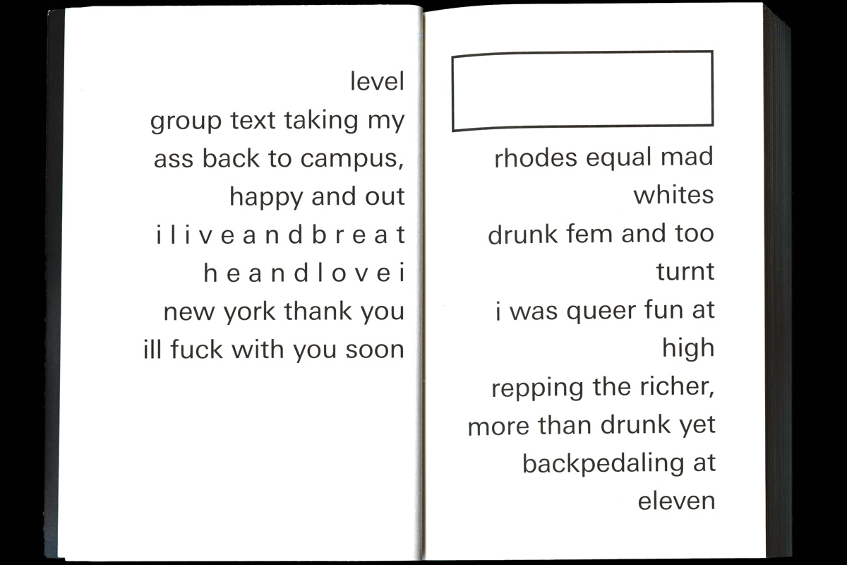
Ser Serpas is an artist from Los Angeles. 2018 in September she had an exhibition at Luma Westbau, Zurich. Together with Fredi Fischli / Niels Olsen she wanted to publish her poems. These are poems she wrote on her iPhone. After some experiments we found the right cover for Ser Serpas.
Weltklasse
Animation
2017
For the workshops "Weltklasse" on the occasion of the poster festival "Weltformat" we were able to create a visual for social media and a poster with the goal of attracting as many young designers as possible to the event. The aim was to incorporate the word "Weltklasse" into the film and look for a black and white conversion. Our idea was to run our own workshop for one day to create the letters of the word "world class". In a second step, we mixed the typical analogue workshop character with the digital level. Our video installation from laptops reminds us of light projections.
Workshop Studio Mut
Posterdesign
2017


At the “Weltformta” Poster Festival I attended the Studio Mut Workshop. The task was to think about what would disturb/excite or make you scream. In a second step, this should be designed typographically in short words on the computer, then projected on neon, orange posters and implemented in different ways. This strengthened the effect of the statement.
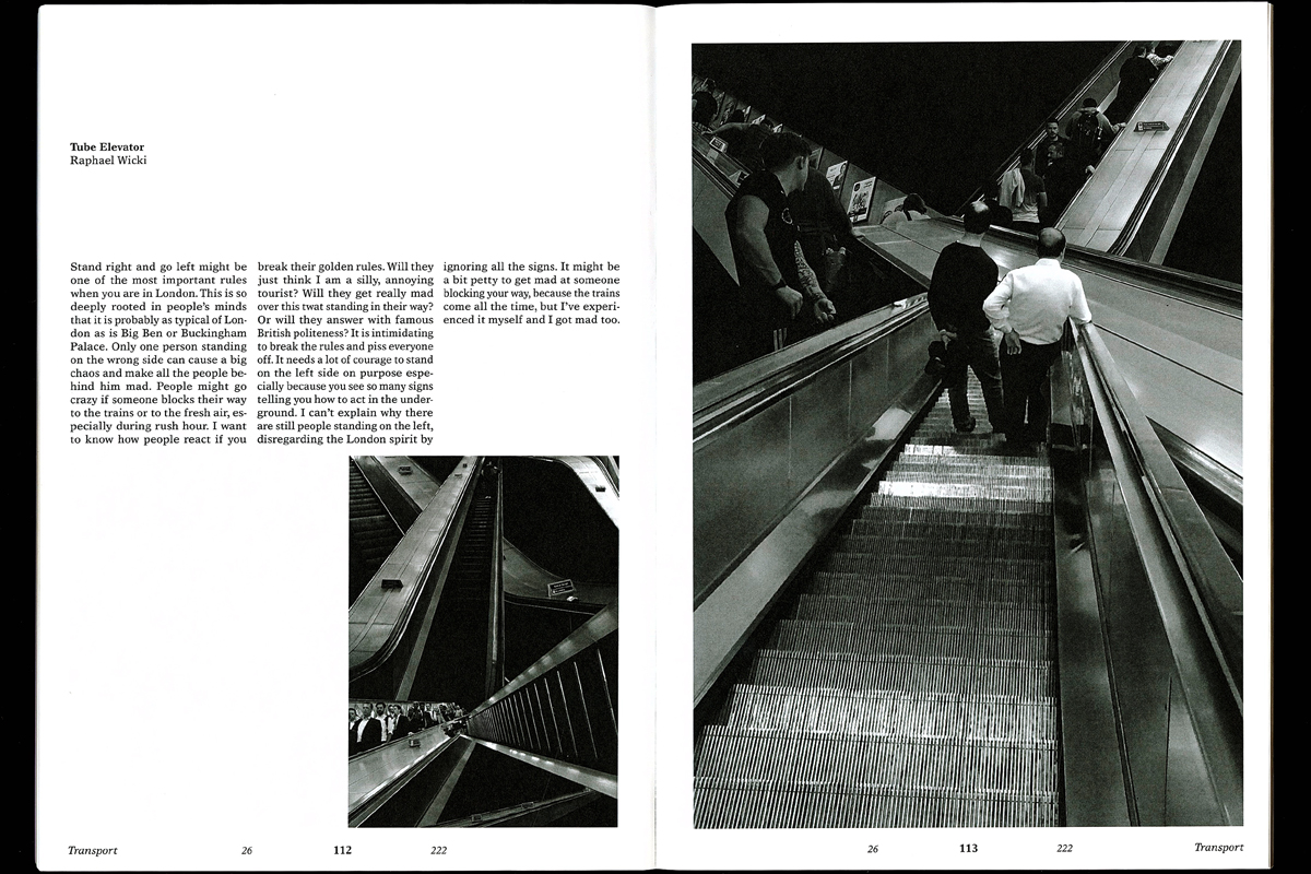
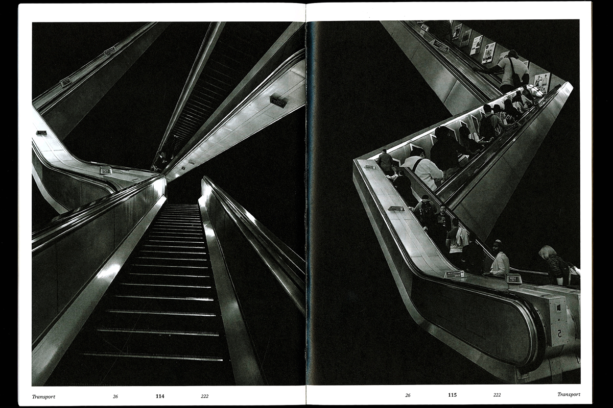
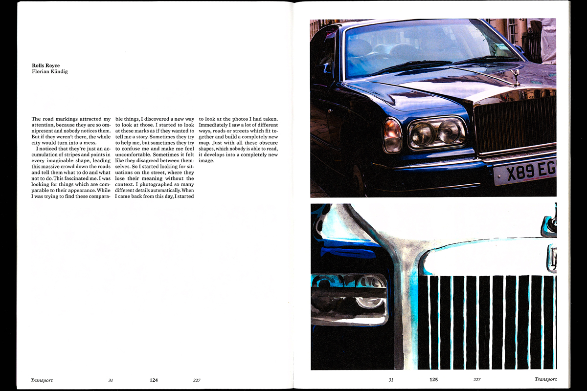
Blechwüste
Photography
2017
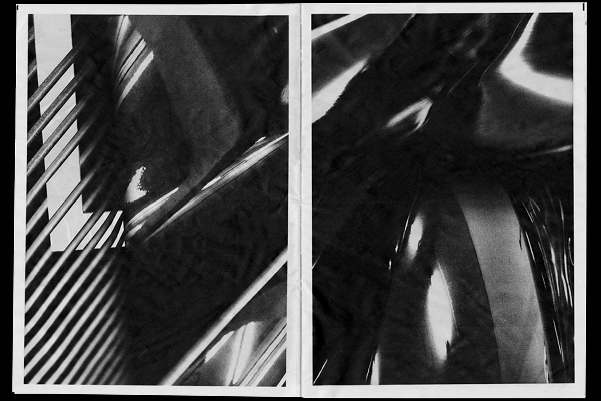
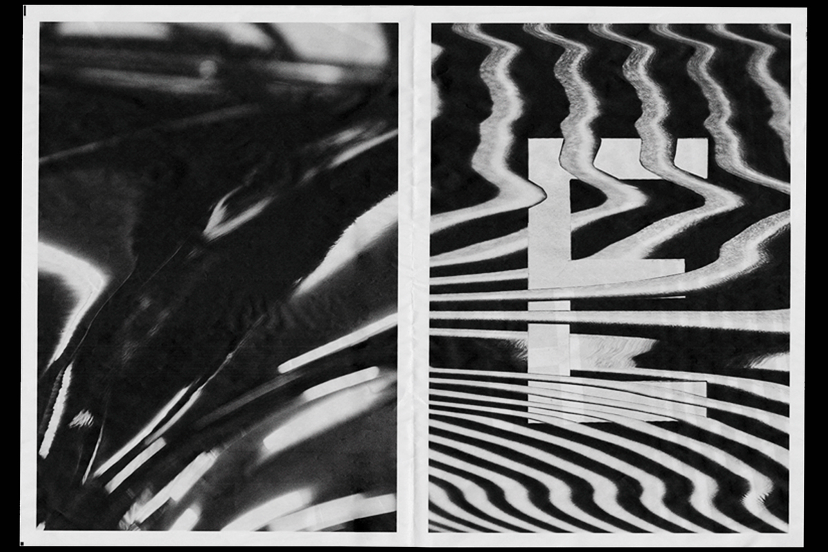
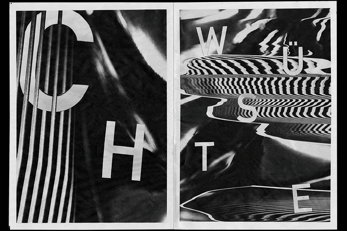
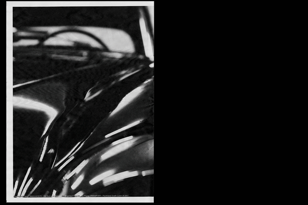
For this project, we spent two days at the Museum of Transport in Lucerne, where we collected material on the subject of "transport". The aim was then to create an analogue newspaper with the photographs and cut-out typography. When I was photographing, I concentrated on the metal sheet and its volume and curvature of cars. I then combined it with other structures of the car. The newspaper represents my opinion that cars are available today in too large a quantity - as a veritable "desert of sheet metal".
Slow
Posterdesign
2017
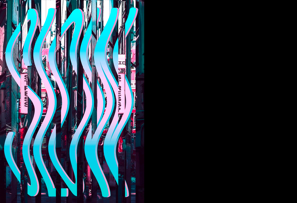
This year's theme of APG's annual poster competition in our graphic school was "Deceleration". This theme and the poster should appeal to passers and stimulate them to think. My poster picks up the everyday life in big metropolises as well as small towns. Nowadays, people are too stressed physically and mentally. The city, cut into strips, supposed to represent the disturbed and stressed everyday life and the slow-motion writing acts as an antipole to it - as "deceleration".
Master-Abschlusskonzerte
Posterdesign
2017

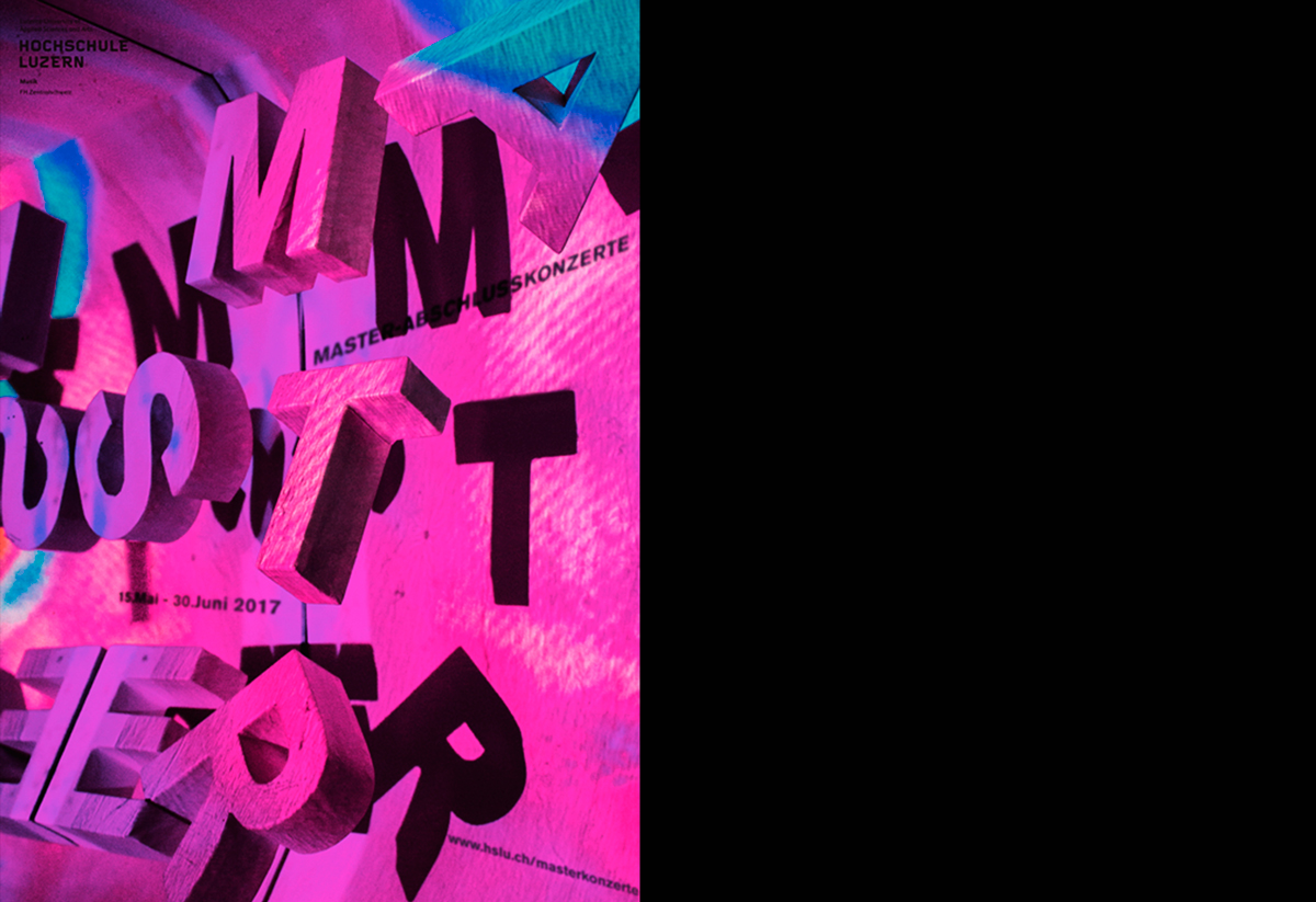
For the Hochschule Musik - Lucerne it was necessary to design a poster for the „Master-Abschlusskonzerte“. The Master Poster is an internal school competition that takes place every year. Our idea was to focus not on a certain music genre, but on music in general. Since music can also be very spacious, we decided to make an analogue, three-dimensional poster.
London Classics
Editorial
2017
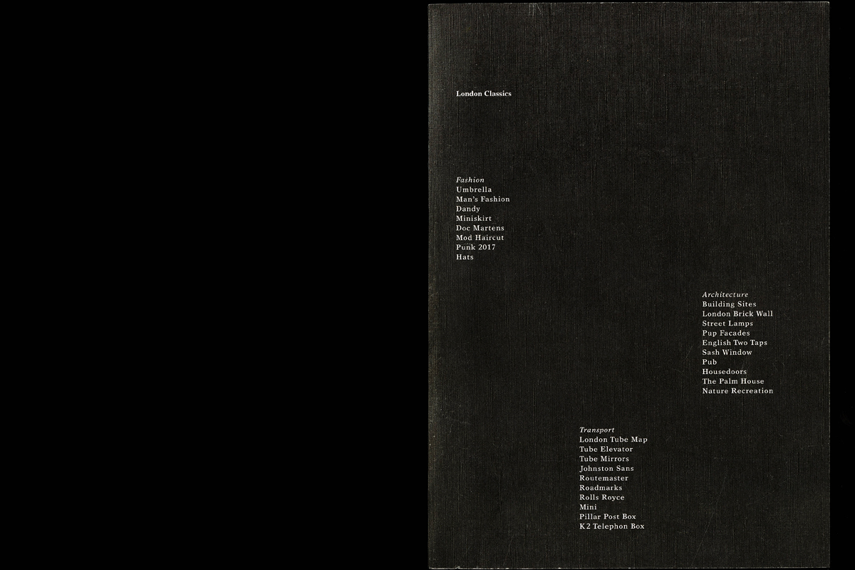
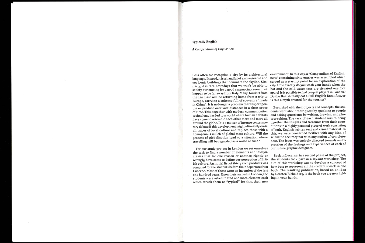
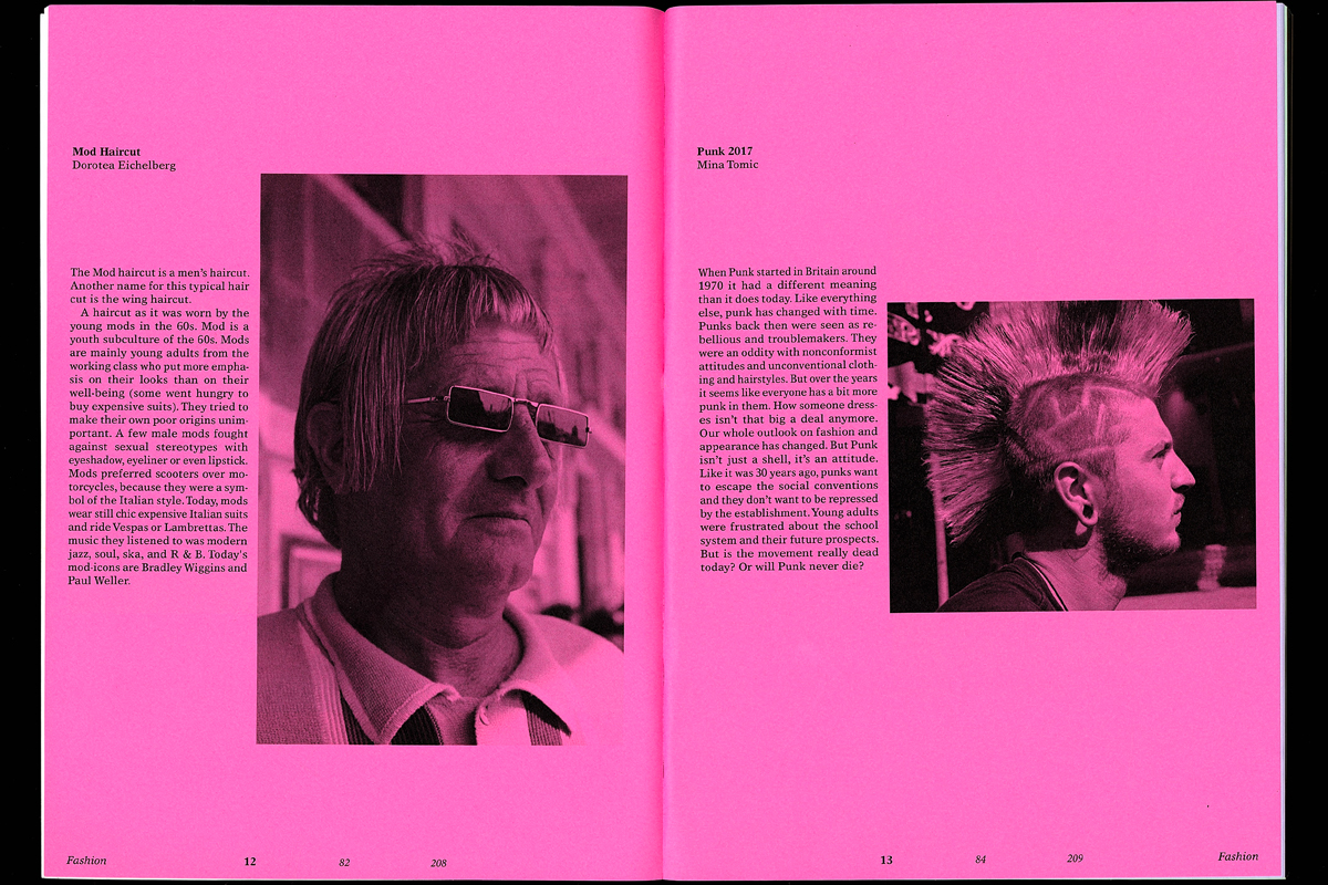
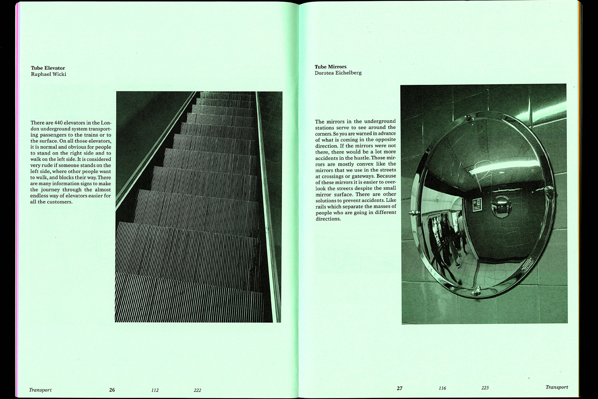
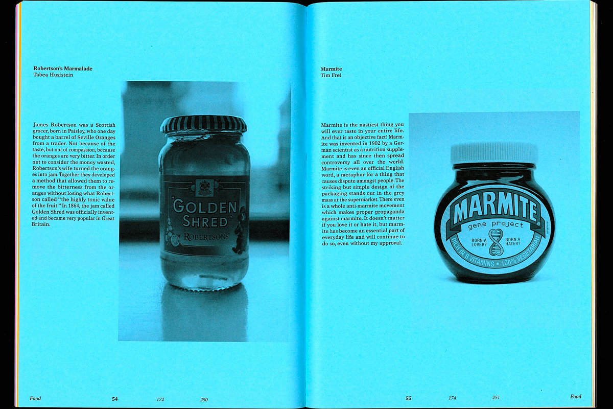
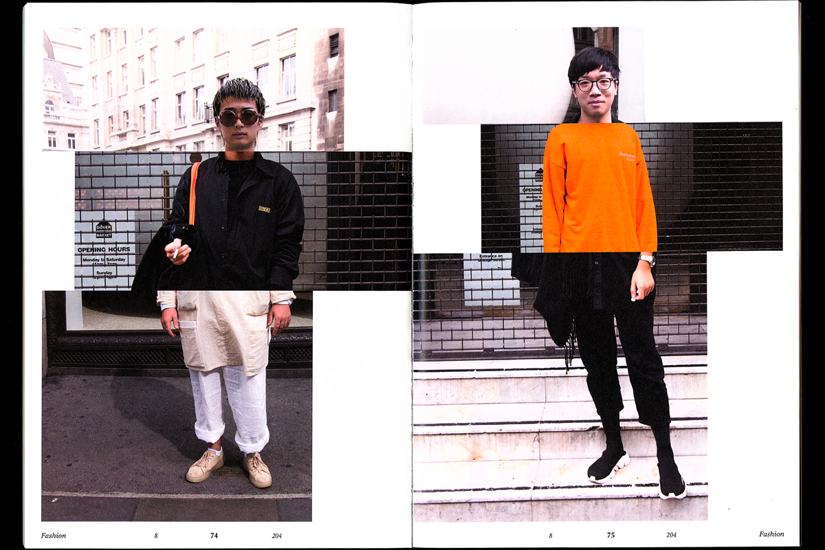
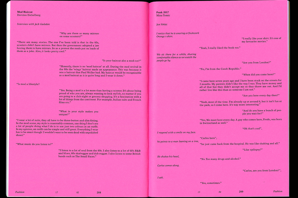
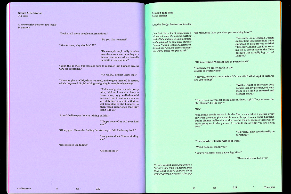
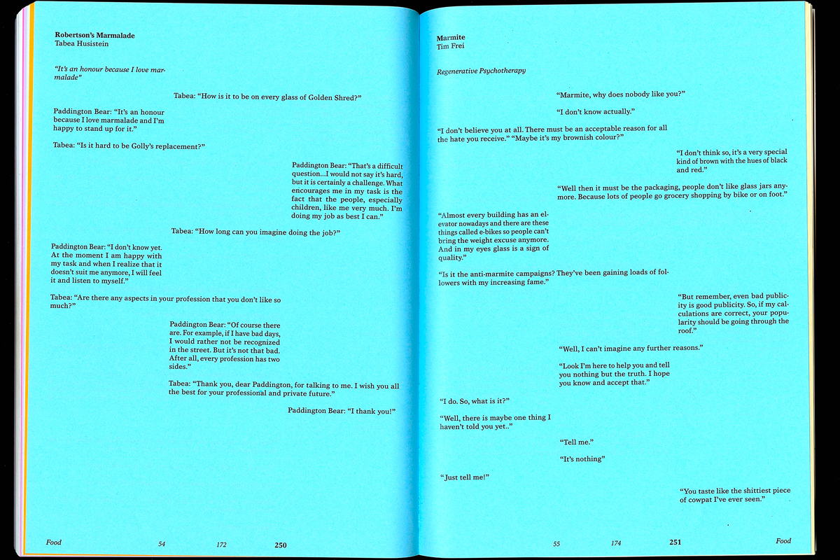
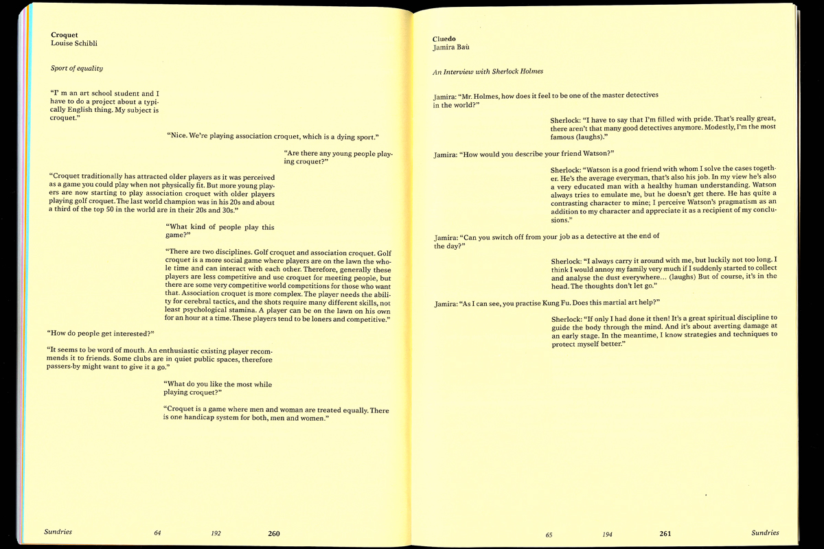
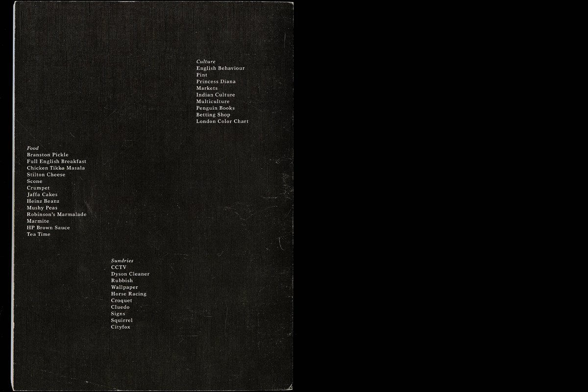
During the two-week study trip to London, each student researched two typical English topics, made pictures and wrote texts. Back in Lucerne, it was the task to develop a concept and create a publication with a total of sixty topics. I divided my book into lexicon pages, essay pages and dialogue pages. This is to give the book a clear structure, but also to provide variety. In addition, I divided the sixty themes into categories and assigned them to a color so that you can navigate through the book even better.
Generated Design
Animation
2016
The aim of this project was to set up rules and thus shape them. In the team we worked out a simple concept for a game, which can be played in pairs or with any number of players. Our rules were simple. A grid served as the basis. Shortly before each game round, we looked at what materials we had available to design, and invented rules based on them that depended on this grid. This resulted in exciting and varied posters. We photographed our work and edited it into a rhythmic, humorous video.